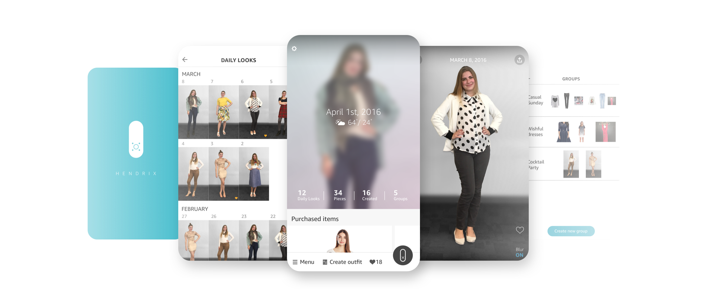
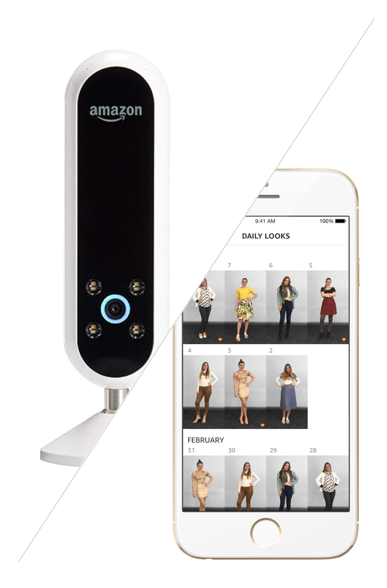
Echo Look
The first Echo device with a camera that helps customers perfect their look.
–
YEAR
2015 – 2017
–
ROLE
Lead app designer
PROJECT OVERVIEW
Help fashion–devoted customers perfect their looks
Echo Look is a unique camera and smartphone app designed to help fashion-devoted customers perfect their look. Through the app, a customer can see what they've been wearing over time, take stock of their wardrobe, and get outfit inspiration.
MY ROLE
Design the end-to-end app experience
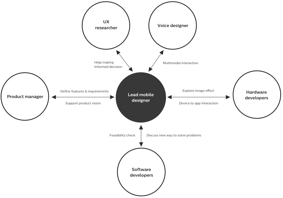
I joined the Echo Look team in 2015 as a lead designer for the mobile app. I worked closely with a product manager to define customer benefits, with a UX researcher to find customer pain points, with a voice designer to identify precise interactions between the device and the app, with hardware developers to improve image qualities, and with software developers to craft the mobile interactions.
Browsing experience exploration
UNDERSTANDING
Gain deeper insights about customers
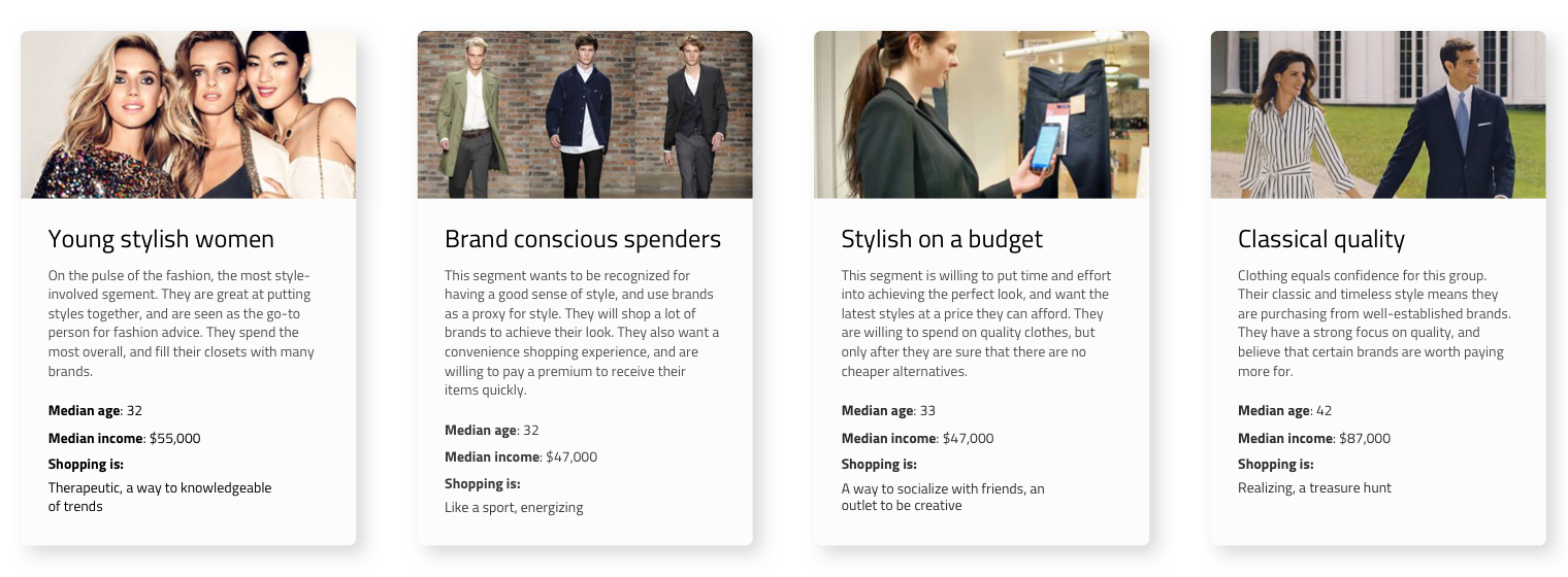
Echo Look was the first Echo device targeting specific groups who care about fashion and style. We first needed to understand how people shop for clothes, why people choose certain clothes over others, what pain points are while wearing clothes, how much they spend on clothes and their lifestyles. At first, we worked with a research agency to define who our customers are.
The team also conducted extensive researches – ethnographic researches, interviews, focus group testing – to find out customer needs and to seek out answers that could drive our product vision and customer benefits.
We also placed two prototypes, TVs with webcams, in two Amazon buildings to study how people pose, what motivates them to take selfies and to gather feedback about using the voice to take a selfie. We could collect over 100 images. The result helped us to find the right placement of the Echo Look device.
KEY FINDINGS
- Customers want to see what they've been wearing over time so they can remember their favorite outfits, steer clear of ruts, and perfect their look.
- Customers want more outfit ideas - as an easy way to make the most of what's already in their closet and to mix-and-match what they own with what they're thinking about buying.
- Customers want to help to discover new looks and want to feel more confident about their style. Does this look good on me? Does this go together? Should I wear this?
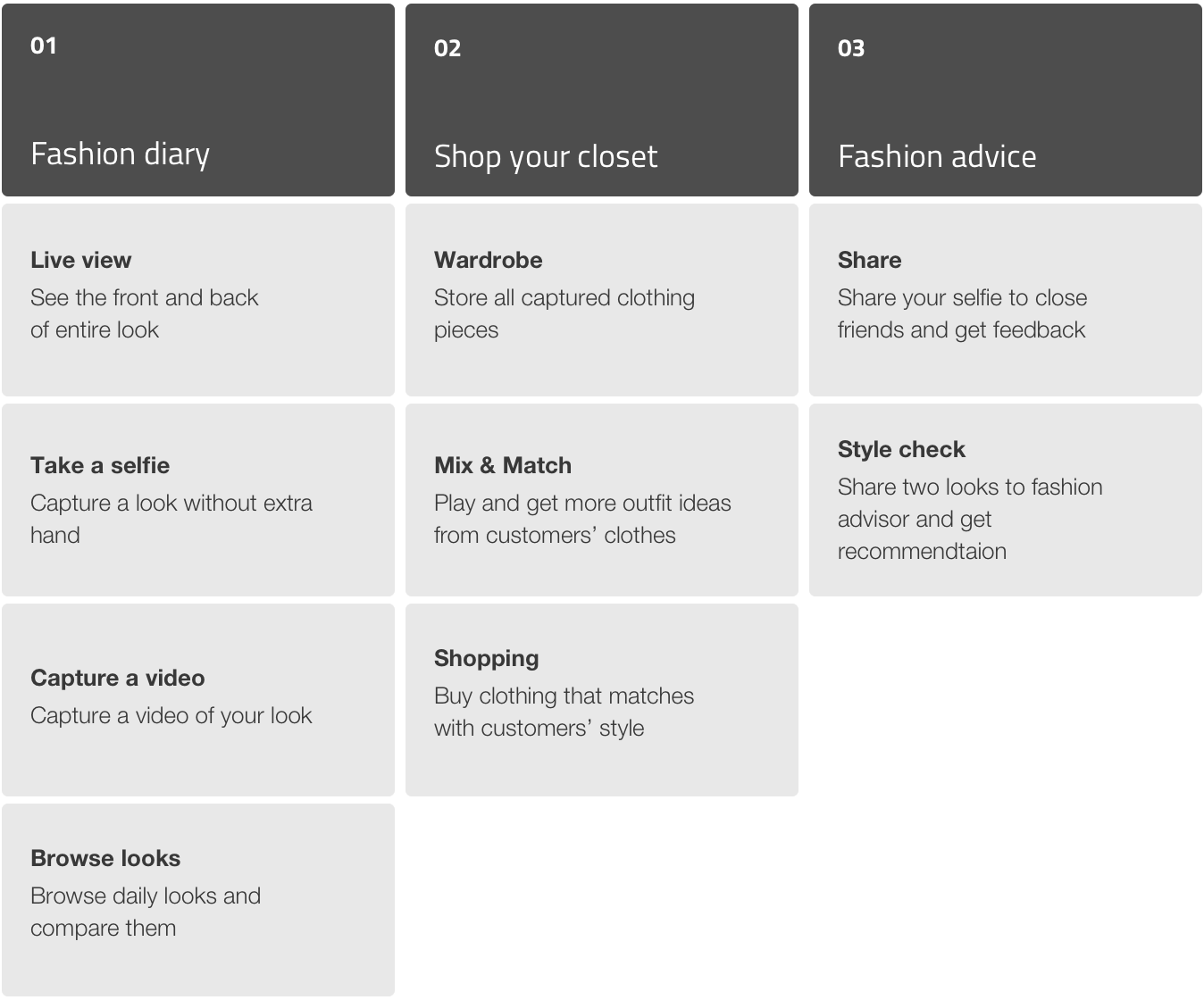
CUSTOMER BENEFITS
We analyzed those research findings and discussed our initial offerings that customers could benefit from. We organized customer benefits into three offerings.
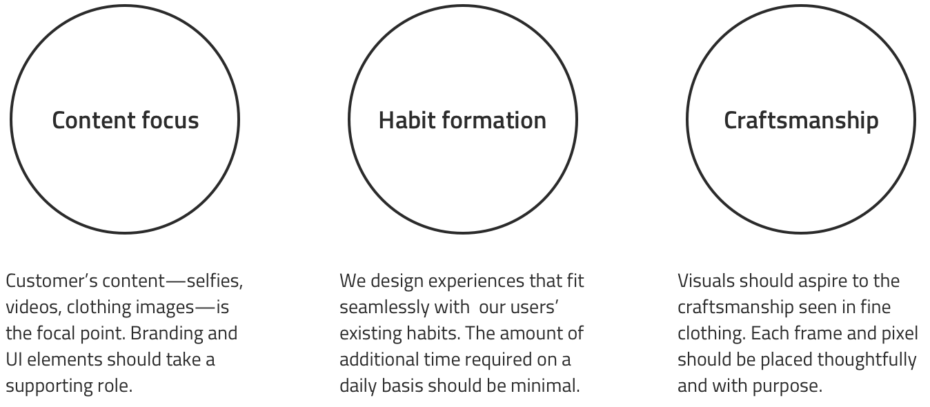
EXPERIENCE STRATEGY
After deciding our offerings for customers, we defined the experience strategy that would guide us to focus on customers' experiences.
KEY EXPERIENCES
Perfect customers look
Real life problems
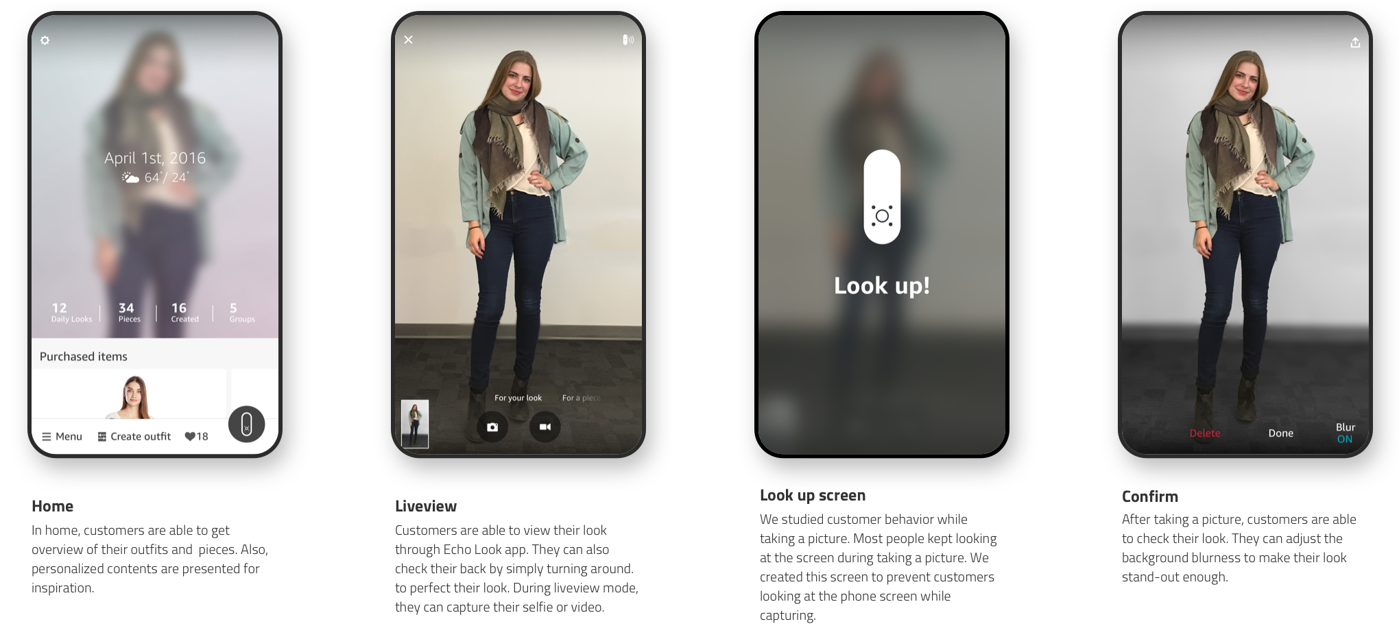
Customers stand in front of the mirror to check their style and to perfect their look. However, it’s almost hard to see the back of their outfits. Additionally, when they take selfies with a smartphone, it’s hard to capture the entire look covering hair to shoes.
Solution
Through the app, customers can check the front and back of their looks. Echo Look enables them to capture selfies or videos without extra hands.
Task flow
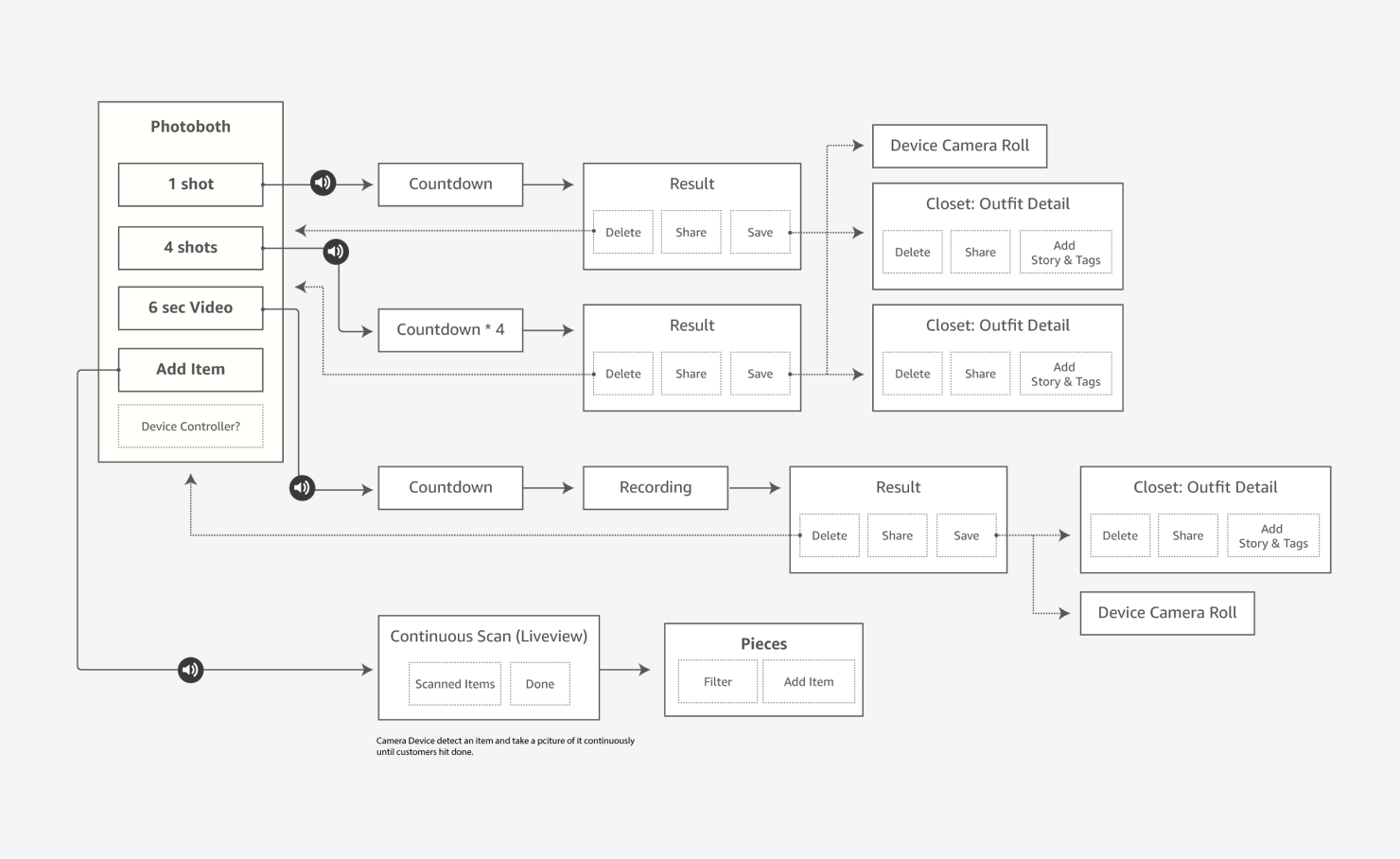
Interaction flow
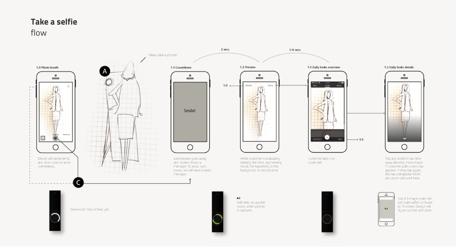
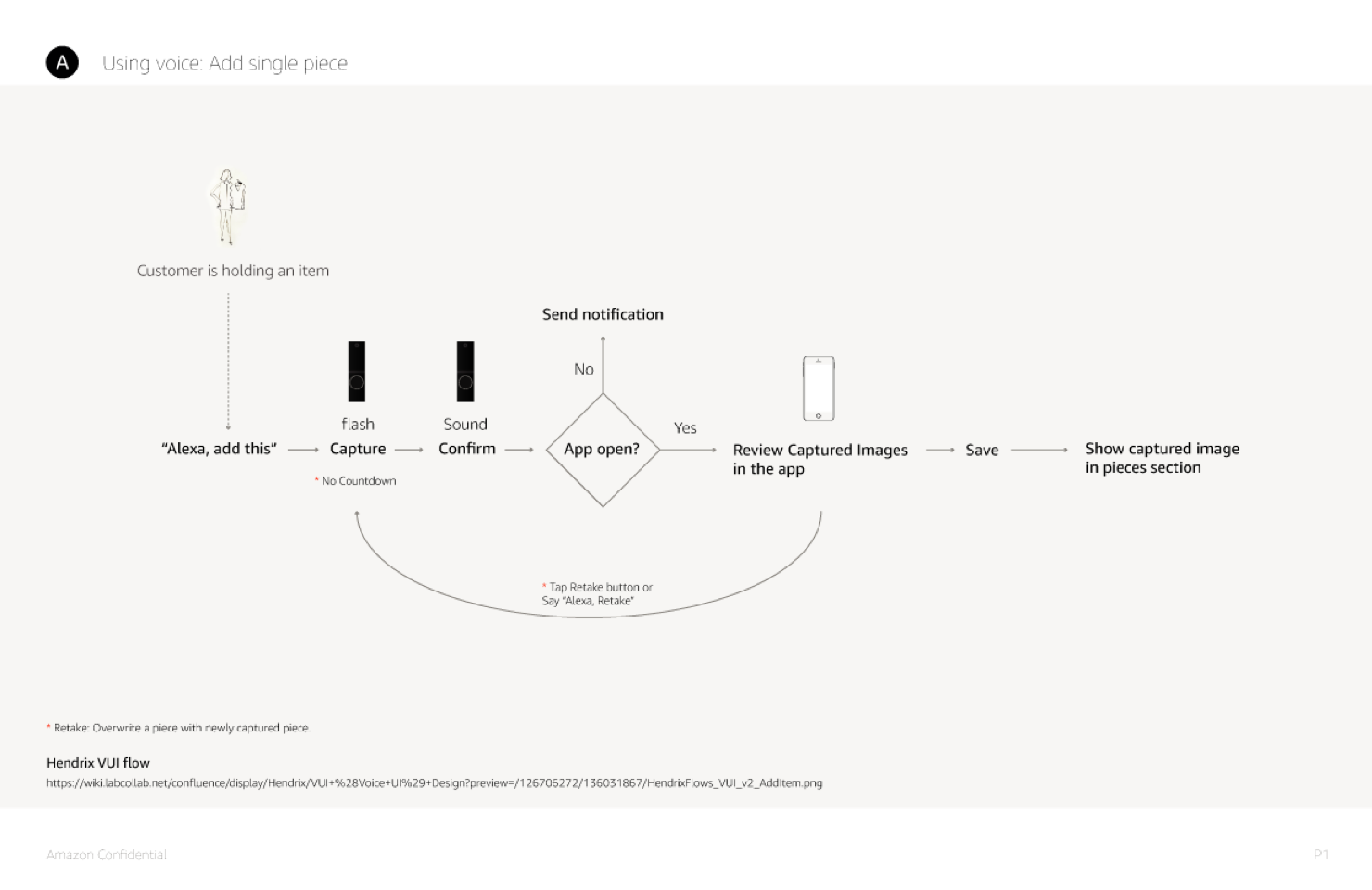
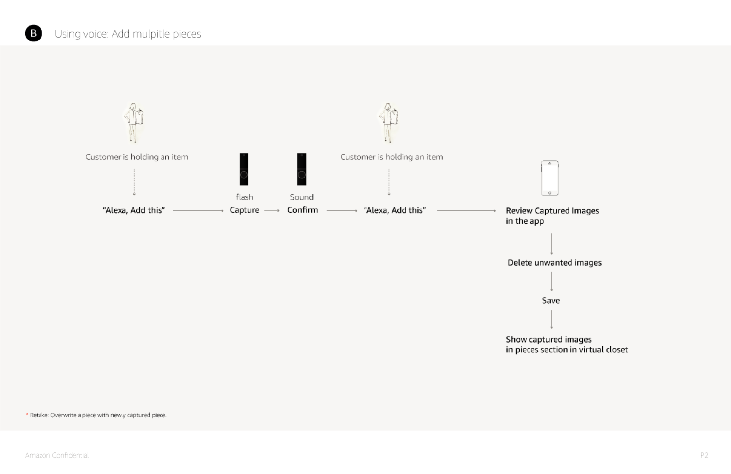
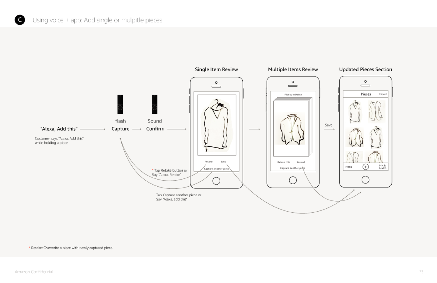
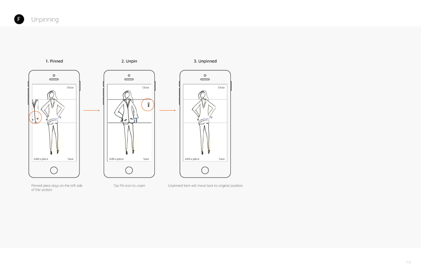
Help customers prevent recapturing.
Test result
We found out that customers tended to look at the app screen instead of the device while capturing an outfit. It increased a chance to re-capture the look because of the wrong postures.
Solution
To perfectly capture their look, we added a screen suggesting to look up the camera after tapping a capture button to capture a look. This helps customers to look at the device while taking a picture and prevents to re-capture the look because of bad posture.
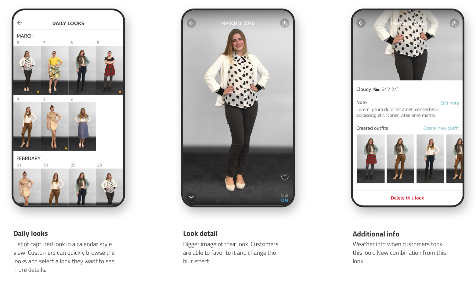
Browsing captured outfits
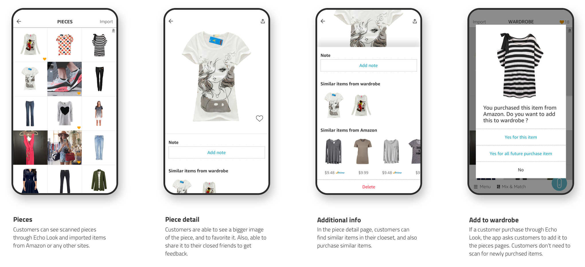
Daily Looks page stores all the captured photos or videos. From there, customers can view and find their looks and also get more details about them, such as finding similar looks and getting recommendations.
I wanted customers to feel that they were the leading models in their fashion magazines. Additionally, I wanted customers to have a fun browsing experience while seeing multiple images for easier comparison. I teamed up with another designer to explore numerous design ideas, and also got excellent inspirations from luxury brand fashion magazines.
Design goal
Bring an enjoyable browsing experience
Easy to compare looks
Display bigger images that enable customers to evaluate the look without going into a detail view
Early explorations
Small failure, big learning
I reviewed those design explorations with team members and also tested with other Amazon employees. They liked how we display the outfit images and had fun browsing. However, they wanted to see more images on the screen. So, that way, they could find old photos faster. This would reduce the planning time of their outfits when they look for inspiration. I studied people's wants and suggested a new design - calendar view. This unique design enables customers to browse looks faster and view many more images at the moment. They can see the more color variation of their looks, which is one of the essential elements when customers choose clothes.
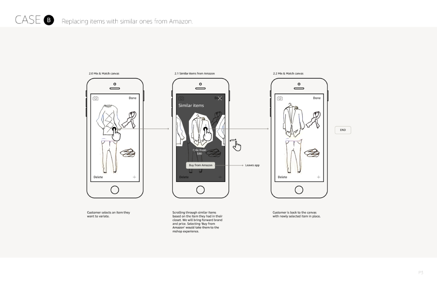
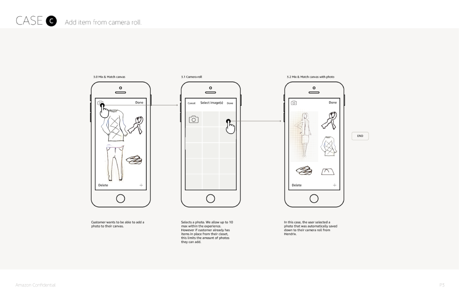
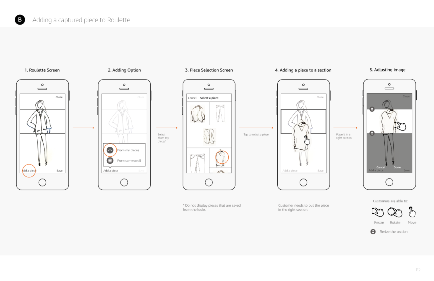
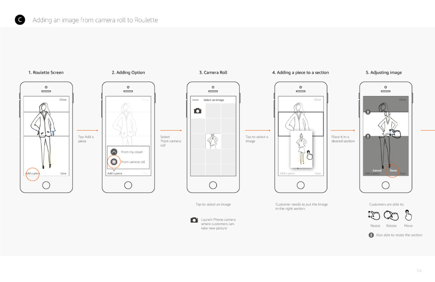
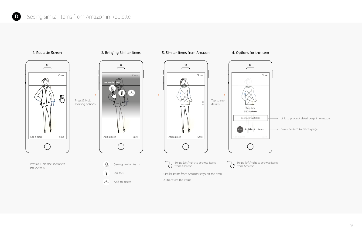
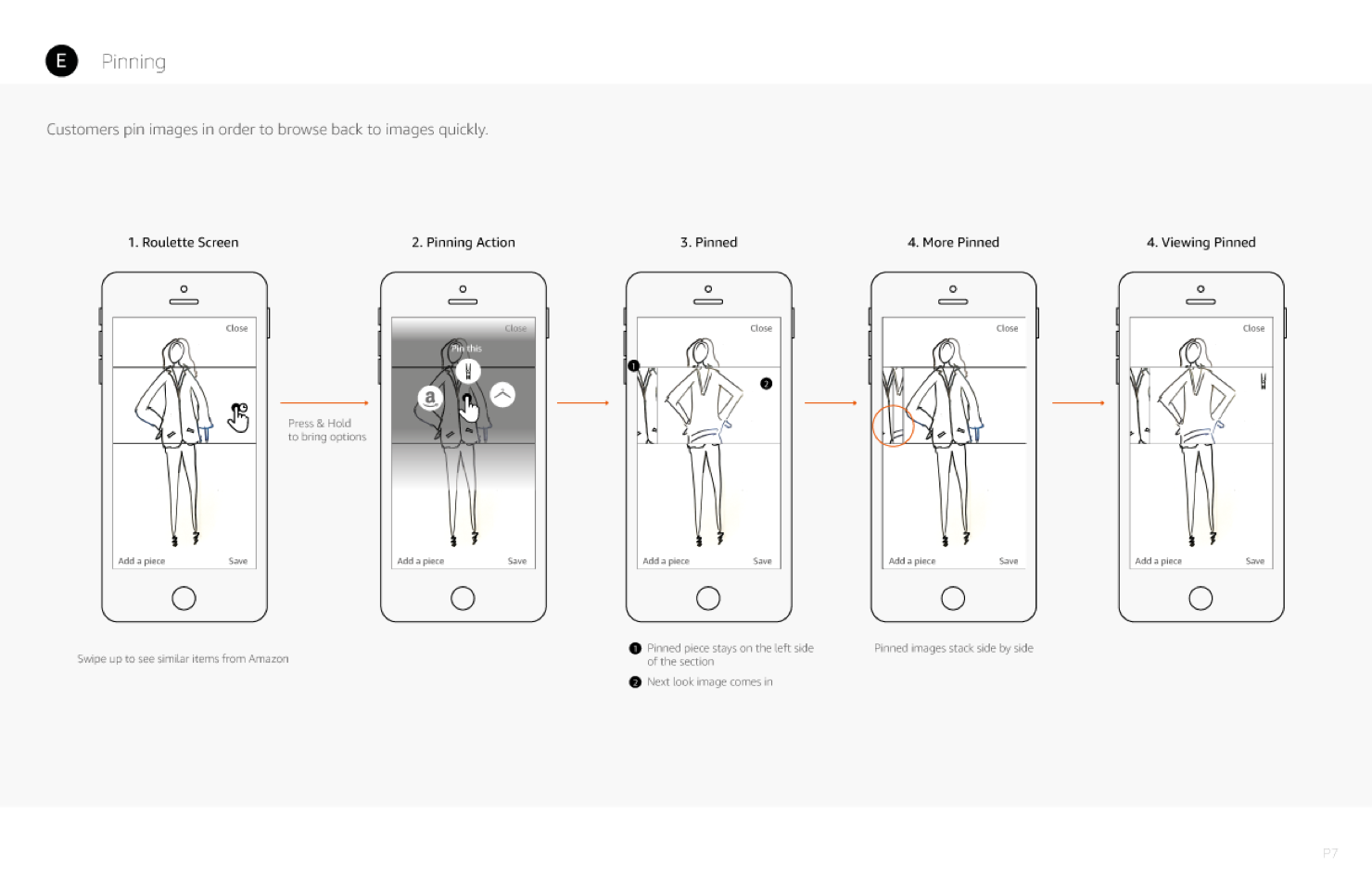
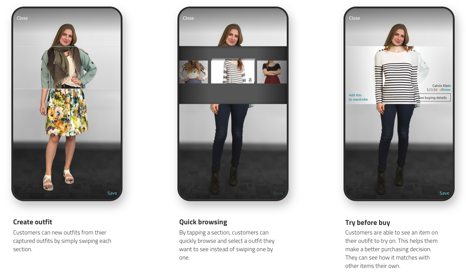
Mix & match your pieces to create new outfit
Research findings
Customers wanted to have a virtual closet where all of their clothing pieces were stored. In this way, they could mix and match new outfits from their pieces, anytime they want.
Initial mix & match interaction flow
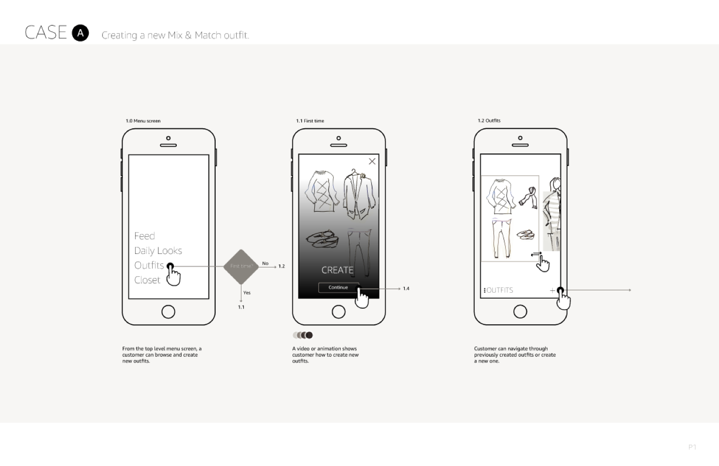
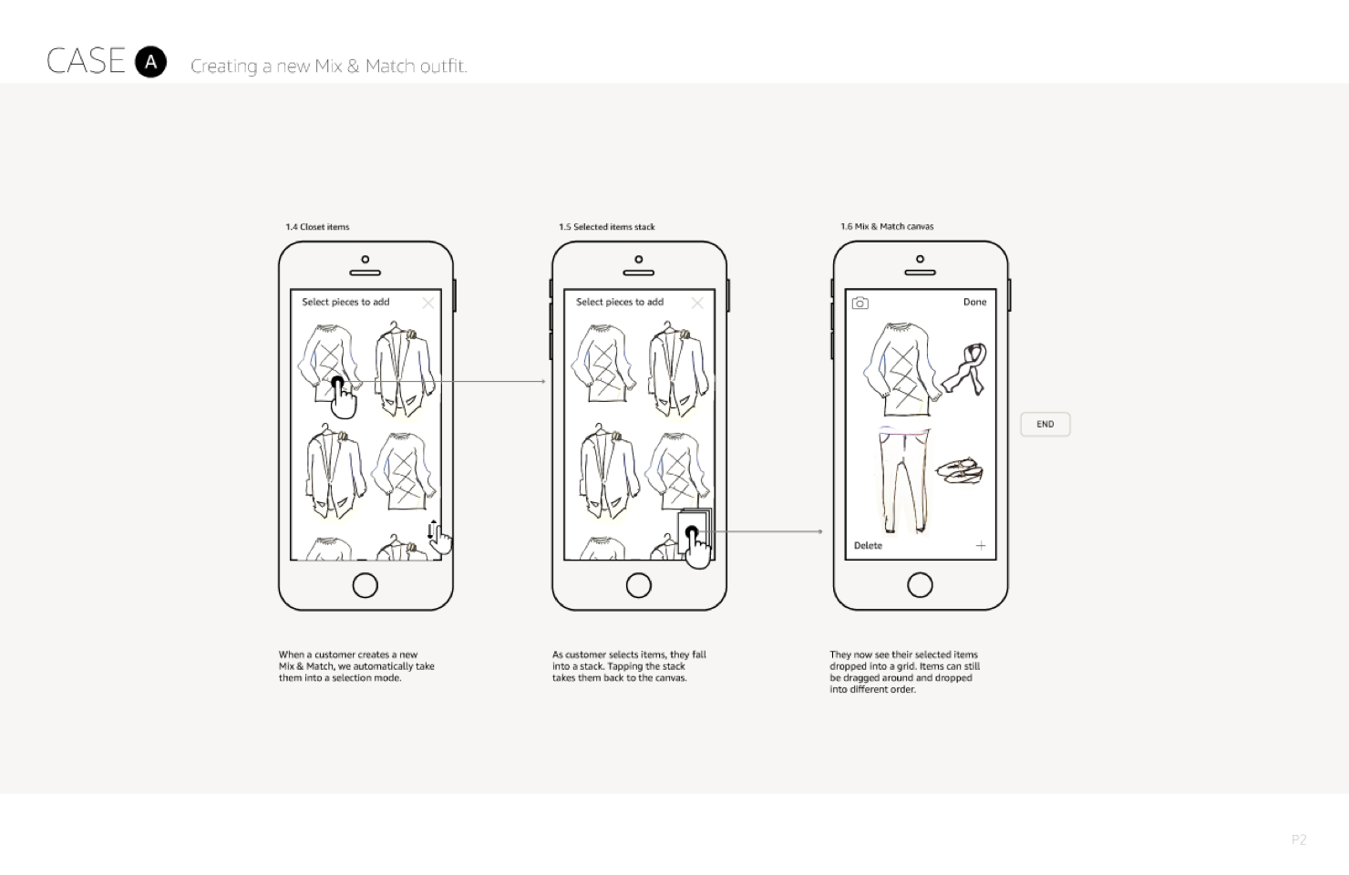
But, there is still a problem.
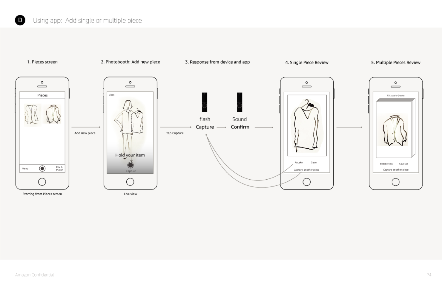
In reality, customers need to scan their clothing pieces first with Echo Look and store them in the app to use mix & match function with those pieces. Even if we provide this feature to customers, there would be less chance of using it because it required lots of time and energy to scan clothes one by one.
Find a new way to mix & match
I couldn’t let this problem go. There is always a solution to a problem. To search for an answer, I explored shopping sites, magazines, movies, and video games. After a few weeks passed, one idea popped up in my head. I sketched the idea and created a prototype to test the concept. I shared with team members, and their reaction was so satisfying. This new way to mix & match not only brings delightful interactions but also encourages customers to take more selfies.

This solution worked better than the original mix & match concept because:
Customers don’t need to scan their cloth pieces. Customers use their looks to mix & match. It might encourage customers to capture more looks. Allow customers to see new clothes on their body before buying.
We built a working prototype for this function and tested it with customers. This new mix & match became the most desirable experience that customers wanted to see in the app.
Detailed interaction flow
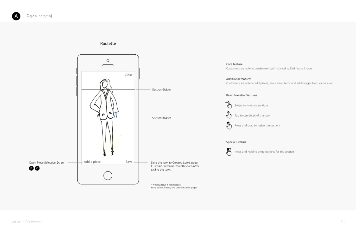
New mix & match UI
Designing for a moment
How might we help customers to use the app more frequently?
To answer this, we needed to understand customers' daily routines first. Most customers plan their outfit a day before. They plan for new outfit combinations and sometimes, do the shopping for new clothes. These shopping moments happen throughout the day.
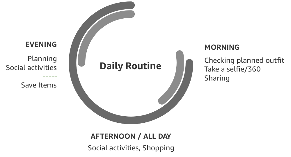
So, we need to find a way to satisfy these moments for our customers - outfit ideas, inspirations, and shop for clothes. Additionally, we offer a function that customers could get fashion advice from real fashion specialists. This brought us a new customer benefit opportunity.
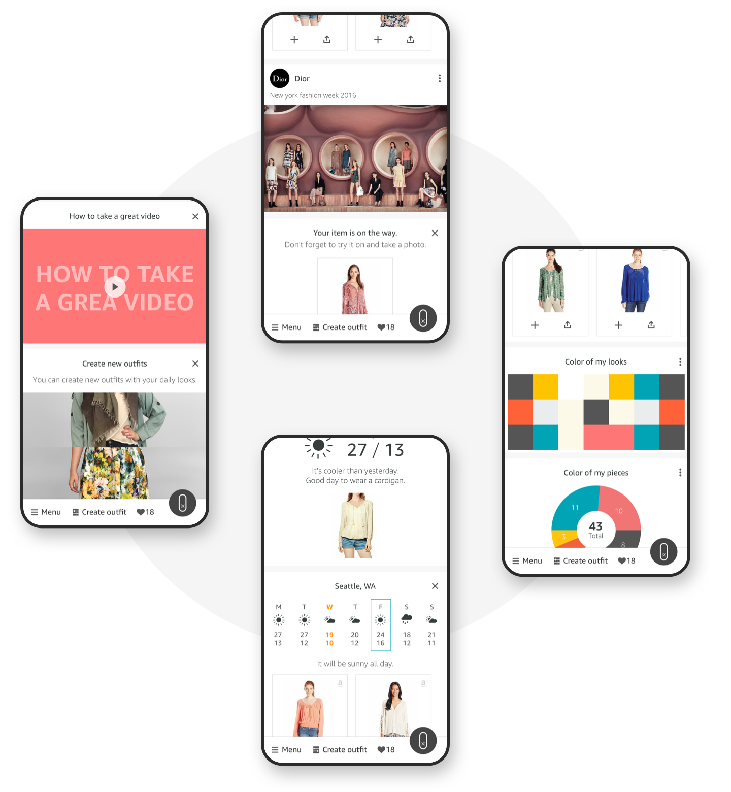
We ideated about content that could bring good experiences to customers—fashion feed where customers find the most relevant information meeting their lifestyle and surroundings.

TECHNICAL CHALLENGE
Removing background
Problem
From the early interviews with prospective customers, we identified that many customers’ closet is not so organized. Even if customers capture their look with lovely postures, the image doesn’t look good because of the busy and colorful background.
Way to find a solution
One idea we wanted to pursue is to blur the background of an image. However, it wasn’t easy to achieve this effect because it required a high-quality depth sensor to cut out a person in a picture, and the result wasn’t satisfying - the main problem areas were hair and foot.
I collaborated with computer vision engineers to achieve the perfect background blurring effect. We tested hundreds of different blur levels and styles to find the most effective blur that makes the main subject stand out. Also, we needed to find a way to cut-out hair and foot areas cleanly.

The early version of software took 8 - 10 seconds to apply the blur effect to a single image. It did not meet our experience bar. While hardware developers were pushing to reduce processing time, I had to find a solution through the app experience.
Solution
Instead of applying the blur effect to the background, I decided to blur the whole image first, then make the main subject appears clear. In this way, we could drive the focus to the subject, not the background.
We decided not to follow this solution because we could reduce all image processing time to 3-4 seconds which is a much better solution.
Conclusion
In April 2017, Amazon launched the Echo Look. It was available to invited customers only. It was my first experience with working on app design with Device. The vast collaboration was needed because there were many touchpoints throughout the experience like voice, app, camera, and shopping.
Ambition vs Feasibility
When we ideate, we wanted to bring good experiences as many as possible to customers. We wanted customers to find it useful. There were lots of good ideas we could offer to customers. On the other hand, we had to face reality. It’s hard to say no to those good ideas. Therefore, we discussed and tested our ideas with prospective customers. It helped us to get the feature set that we wanted to offer. Also, within given time frames, it allowed us to focus on core experiences. Once we build a good structure, it would be much easier to add new benefits to customers.
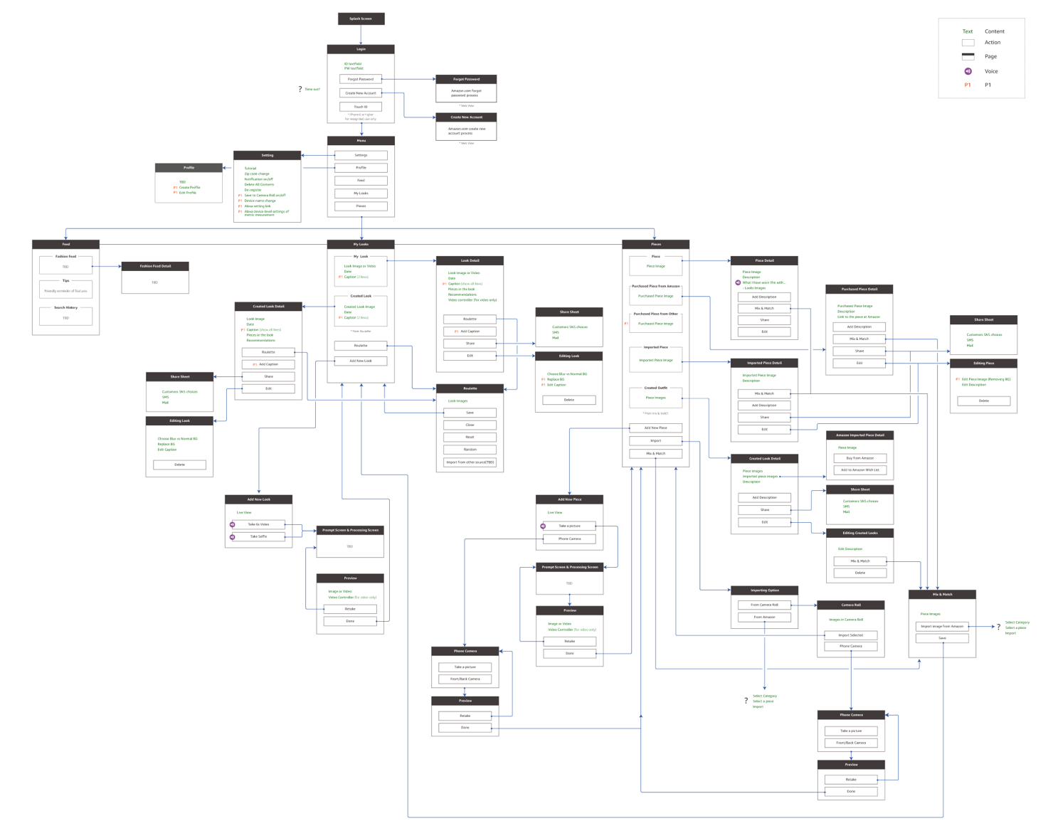
Initial app structure
What customer wants vs Reality
It is very hard not to add functions that customers wanted. However, there were gaps in what customers want and what they need to accomplish their desire. The designers' job is to make those experiences more enjoyable in a simple way. It was very challenging for certain functions because it required customers' effort to enjoy the experience that we provide truly. On the other hand, this challenge brought new opportunities. That's why the new way to Mix & Match (project name is Roulette) was born. This new feature brought us another possibility as well.
It was a great journey to work on a new product for specific target groups. I enjoyed working in an environment where customer-first minded people devote their time and energy to build the best possible experiences to customers.