MOBILE
APP ICON
More modern, fresh, and representative of the role that Amazon plays in our lives today
–
YEAR
2014
–
ROLE
Lead designer
-
LAUNCH DATE
2014
PROJECT OVERVIEW
Amazon is much more than just a way to buy things
The redesign of the Amazon app is being driven by a few things: responsibility for the icon to better represent the Amazon brand and the future capabilities of the apps, including extending to more than just physical products, and a chance to modernize the dated visual styling.
MY ROLE
Design a new Amazon mobile app icon
As a part of the Platform design team at Amazon, we looked at many different aspects of Amazon mobile app. One project was to re-design Amazon app icon because it felt out-dated and doesn’t represent Amazon’s future capabilities at that time. I own this new icon design and presented it to design VP, mobile app VP.
Start from a cart
The app icon is composed of the Amazon logo, cart, and a blue box. Among other elements, the cart has been imprinted in people’s memory for many years that it symbolizes shopping. However, we wanted the app icon to represent more than shopping. I started designing cart icons first to find the right one that became the new iconic symbol for Amazon.
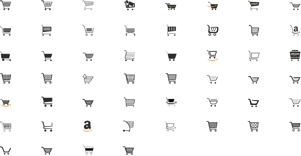
Icon design exploration
After design various cart icons, I started designing the app icon. In the beginning, I divergently created icons to explore more ideas until reaching the one we want to present to customers.
The first review
After exploring more than 60 icons with different design approaches, I conducted informal user testing to get feedback from team members, and finally narrowed down to two icons. I presented them to a design manager and a director of shopping design. After getting approval from a design manager and a director of shopping, we reviewed these two icons with senior leaders, including VP of shopping design, a director of the mobile app, and a mobile engineering director. Also, I shared all other design explorations to support the rationale.
Key feedback
- This new app icon should reflect the present, and also the future — physical products + digital products.
- Not to surprise our customers, we need an icon that is evolutionary, not revolutionary.
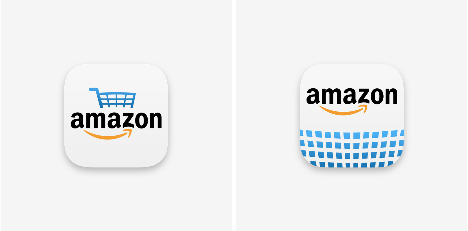
Evolution, not revolution
The new direction has been set, and I started exploring icon designs again. I tried to maintain the old icon structure and wanted to achieve the feeling of the future.
The chosen one
Finally, we all agreed to go with an icon. This new icon feels revolutionized from the old one while expressing the future of Amazon, a store truly sells everything from physical goods to digital products.
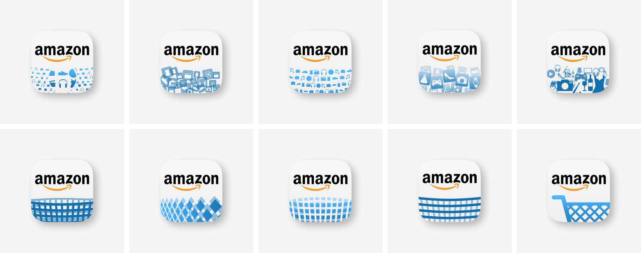
Conclusion
One icon is done. Now, we needed to look into all other icons from different businesses like Amazon local, Fresh, Music, and kindle. Each icon is unique as its own, but the sense of unity was missing. We proactively designed new icons for them by following the new shopping app icon design.
We presented these new sets to each business team and got really good feedback about the new direction. Amazon's local team adapted this new direction.