Philips Sonicare App
–
YEAR
2019 –2020
–
ROLE
Lead UX designer
Background
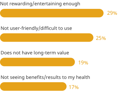
Philips Sonicare app has been serving users for about 4 years. However, the app lost its core value over time even though the team added more features to patch the experience holes (not a good way to improve user experiences). As a result, the app's adoption rate is very low comparing to the number of brushes we sold. The team needs to rethink the whole app once again. I joined the team to build a UX foundation that enables the team and users to find good value from the app.
My role
My main responsibility is to design the experience that helps Sonicare users to build a better brush habit.
- Define new UX visions that improve long term oral health
- Enhance mobile interactions and visuals
- Deliver UI specs, prototypes, and design assets for iOS and Android
I worked with all members of the Oral care team throughout the process, including industrial designers, firmware engineers, and legal counsel. But, day-to-day, I communicated with the core app team:
- UX designer (me)
- Product manager
- Program manager
- UX researchers
- App developers
IDENTIFYING PROBLEMS
The users
Philips Sonicare toothbrush has two primary target users - Trailblaze & Carer. The app team adopted these target users because the app is not standalone.
Trailblazer
- Heavily engaged in all aspects of oral care with complex health and cosmetic needs. Overall oral health is a top priority as is white teeth and fresh breath.
- Functional priorities: Promote long-term oral health, remove plaque and bacteria, keep gums healthy, clean between teeth & do as my dentist told me.
- Emotional priorities: Feel confident & comfortable, presentable & more attractive.
Carer
- Sophisticated needs, heavily focused on superior oral health & maintaining holistic health.
- Functional priorities: Avoid cavities, promote long-term overall health, remove plaque & bacteria and follow the advice of DP’s.
- Emotional priorities: Feel clean & hygienic and prevent worrying about the condition of teeth & mouth.
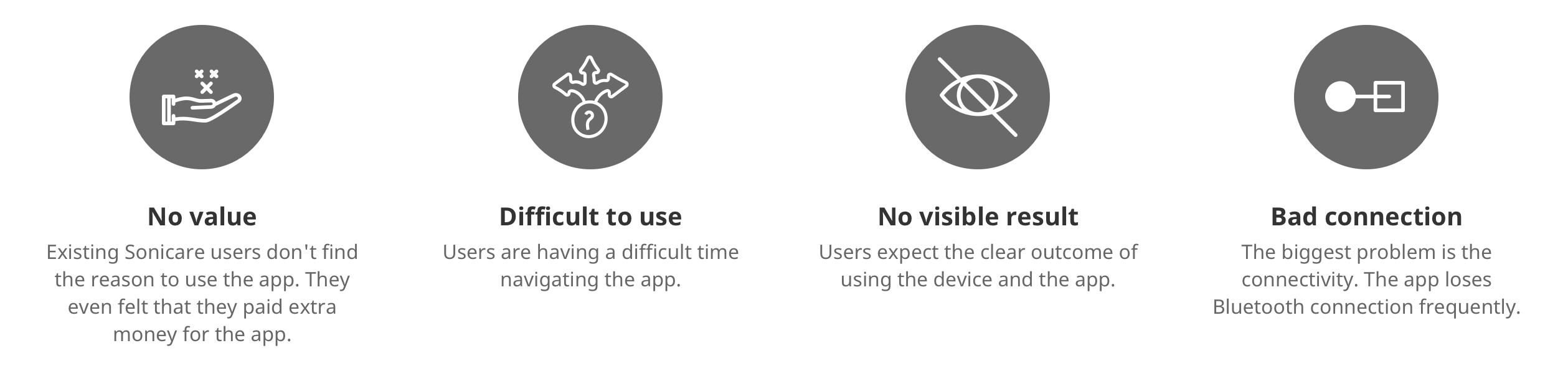
Problems
We identified 4 key problems from the early research findings that the current app users were facing.
Experience principles
I always start defining the principles before doing the design works. These principles help the team and me to stay focus on users and original intention.
Respect
We respect users’ time and lifestyle. We design experiences that fit seamlessly with our users’ existing habits and make them better.
Trustworthy
We deeply understand our users and strive to make every user experience trustworthy from a brand perspective.
Personalize
We show our users how to create personalized experiences that help to improve oral care habits that lead to better oral health overall.
Delight
We design experiences that not only meet users’ needs but look for opportunities to delight users.
Scalable
We design experiences with the long-term vision in mind. We create strong foundation that enables us to solve future problems without deviating from our core values.
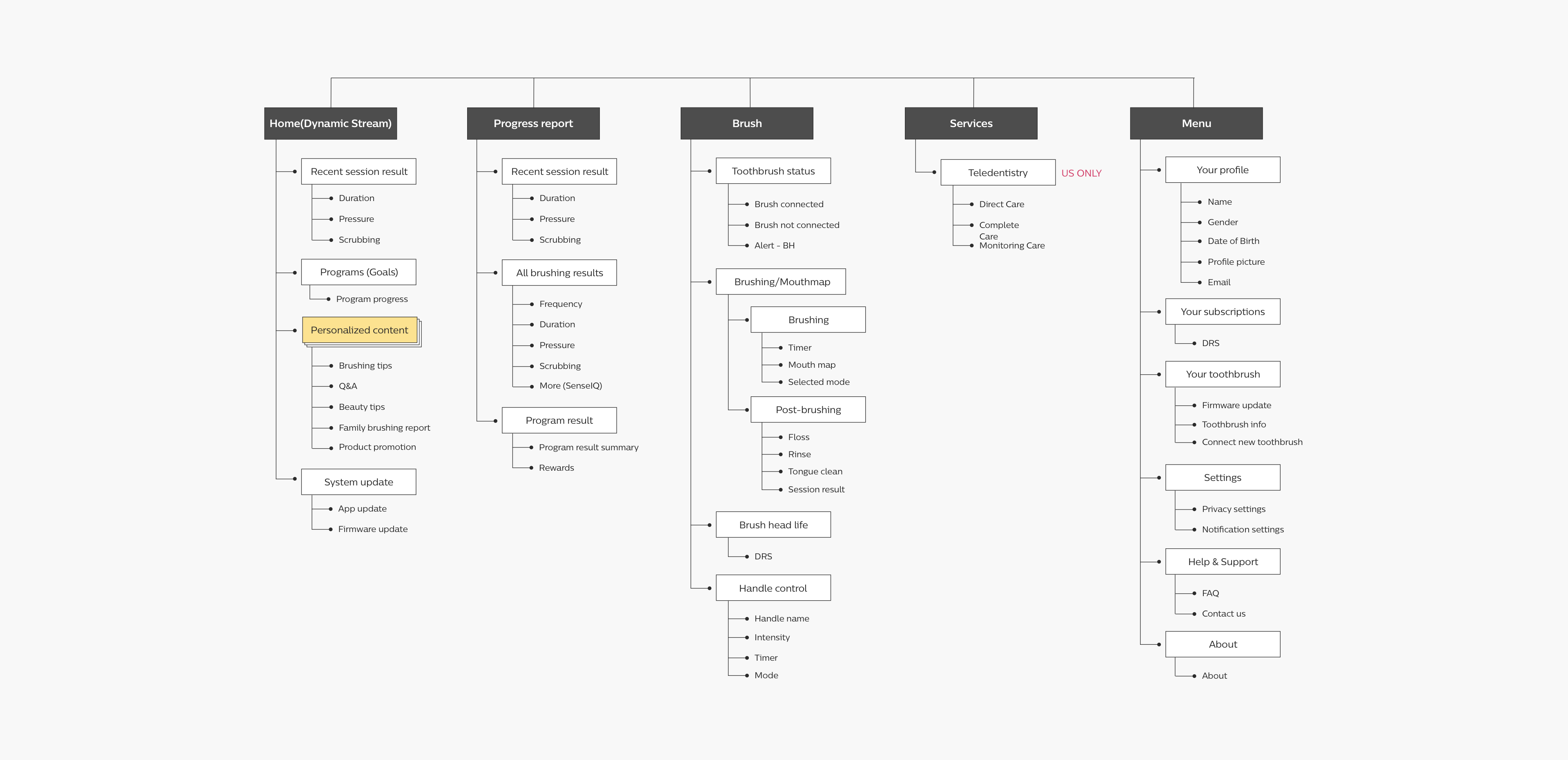
Redefined the app structure
I first rethought the app structure to solve navigation problems, feature discoverability issues, and find a scalable solution
- Analyzed all features in the app
- Grouped and moved features into the section they belong to
- Moved the main section icons in the bottom nav bar for easy access
SOLUTIONS
Direction
The app core team spent a week identifying all user pain points and came up with solutions that could empower users to take care of their oral health by building a better brush habit.
We innovate in superior oral care solutions to bring healthy, confident smiles to all. Today and tomorrow.
Mission statement from the Oral Care leadership

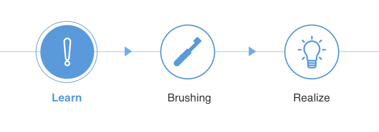
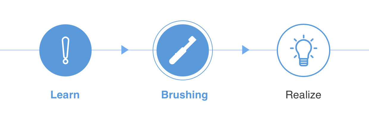
Learning materials
The app plays a supporting role by providing bite-sized learning materials that users could learn how to take care of oral health.
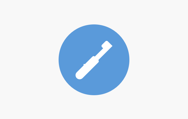
Improve guided brushing
Users can practice the right brushing technique by following the guided brushing - 2 min, brush entire teeth, proper pressure, and scrubbing.
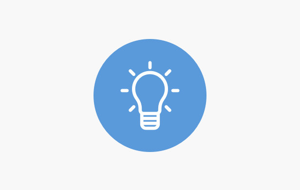
Realize brushing patterns
Users can track all the brushing patterns that would help them realize how they brushed and what to improve.
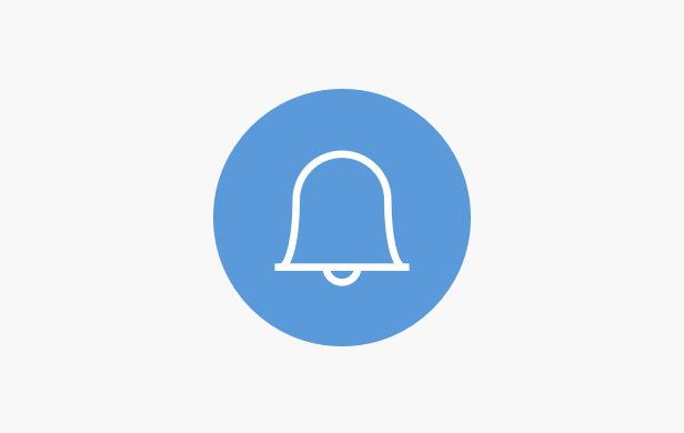
Prompt & reminder
The app helps users stay on track. It reminds users that oral care is long-term practice, and also informs them how to achieve short-term results like whitening tips.
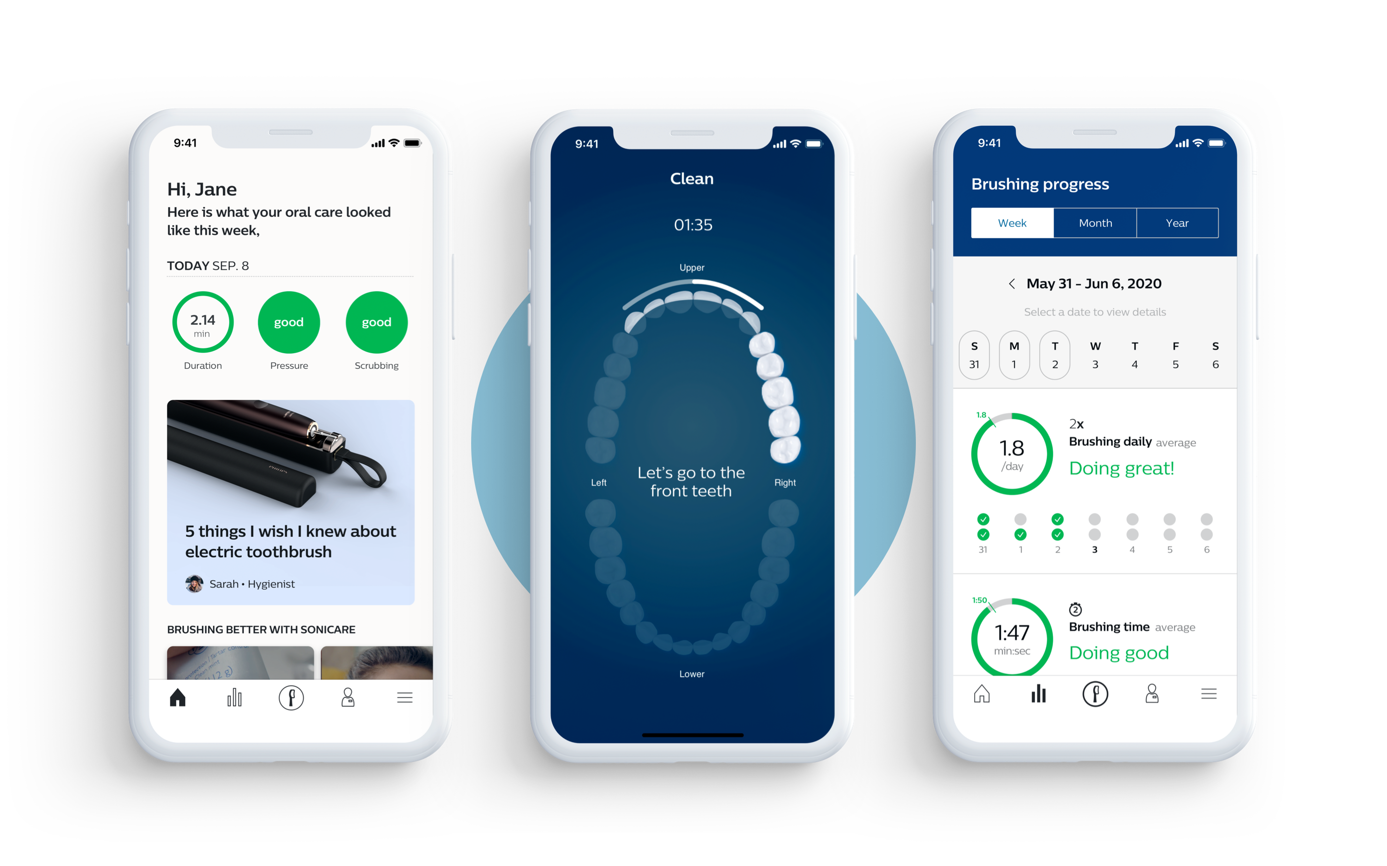
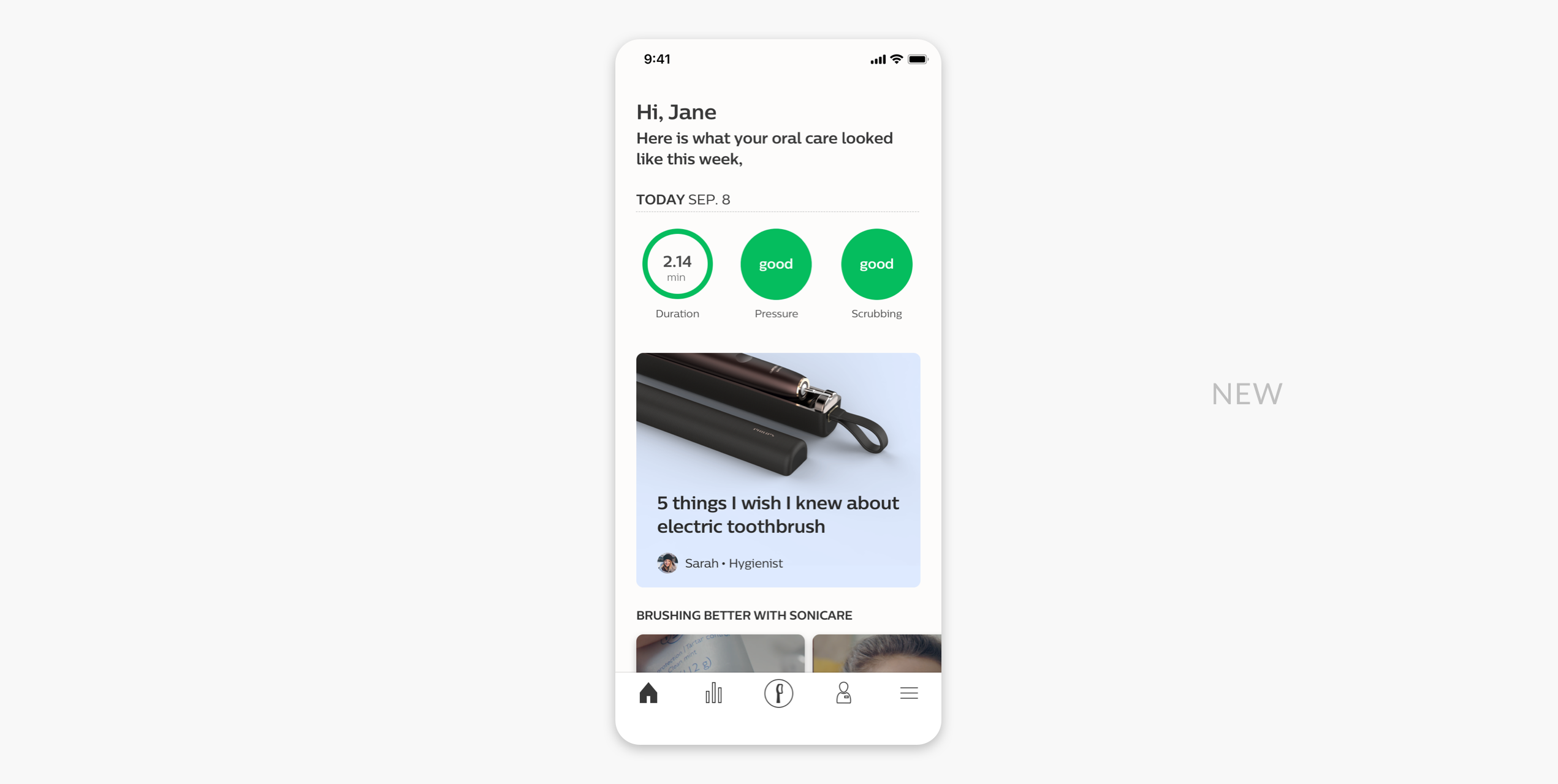
New home experience
A place where users could see the most relevant information based on how they do and what they prefer to help them to get or stay on track.
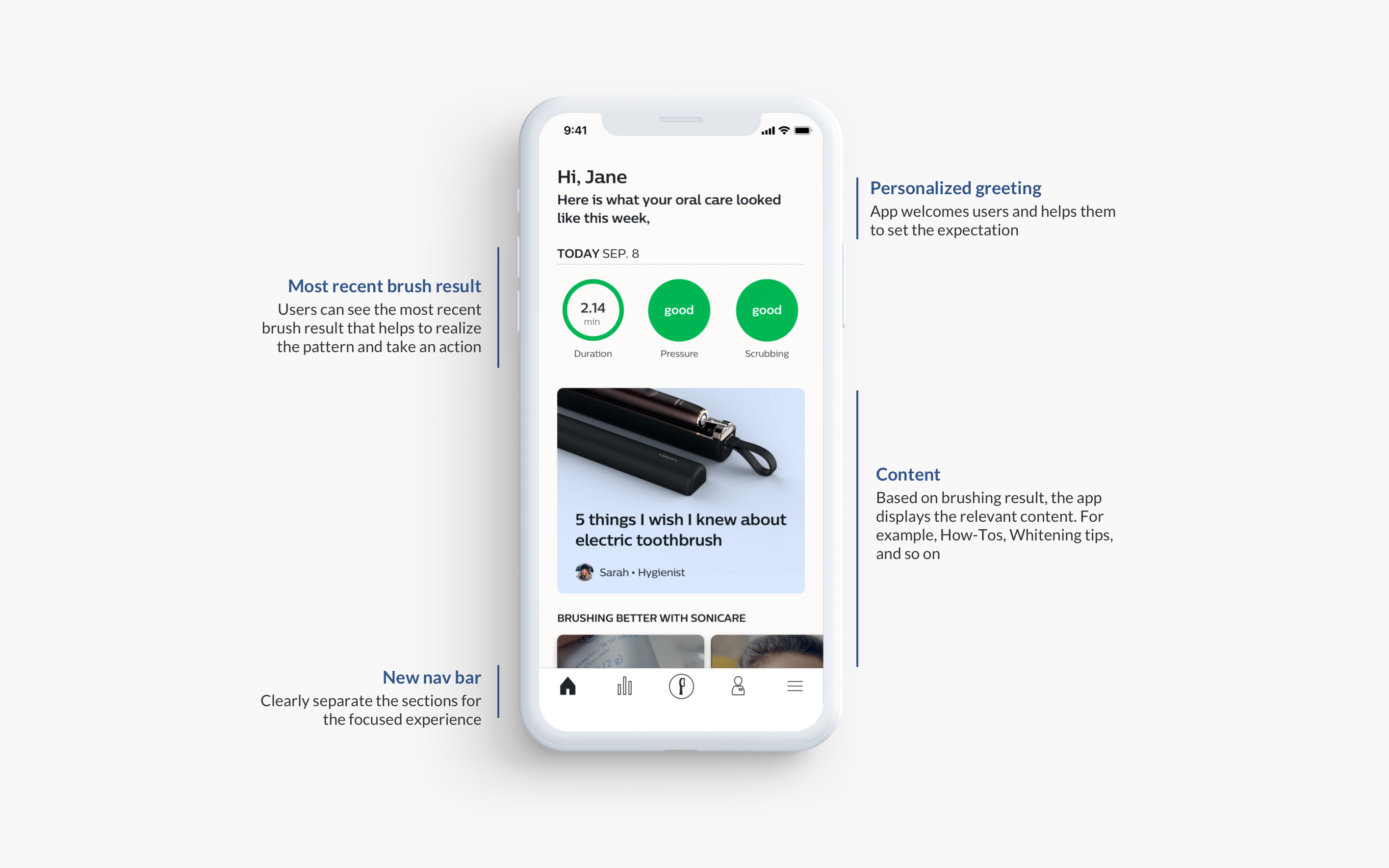
Birth of home
A home is a new section we introduced to users. The old app's home was nothing but showing the brushing data. After the brainstorm session, I had several deep conversations with a product manager about starting point of the oral care journey. I suggested a new home concept that users could learn about oral health by reading curated content, and we could also learn from users by asking questions.
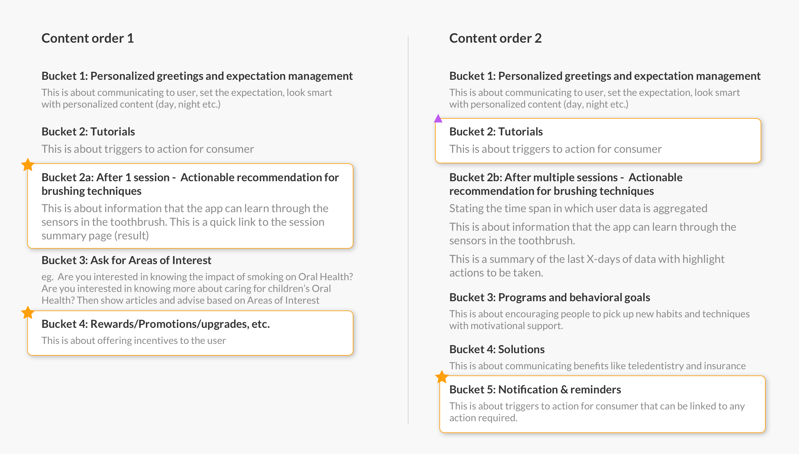
Testing content order and type
Researchers conducted user testing sessions to test the order and type of content. Later, researchers shared the test findings and shared insights that helped us to make informed decisions about the content order and type.
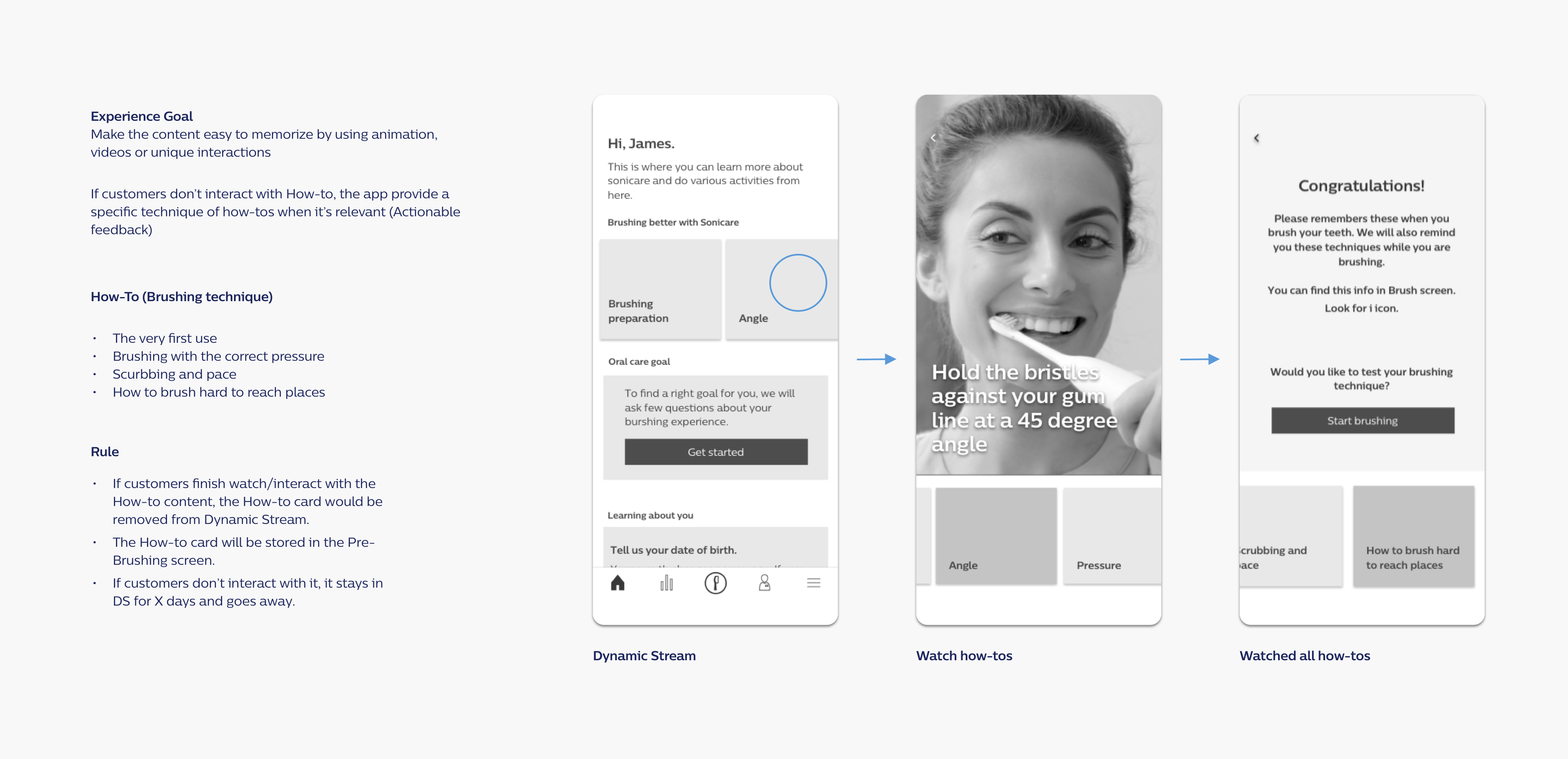
Experience goal
- Make the content easy to consume and memorable by using animation, videos, or interactive media.
- Provide the most relevant content based on obtained brushing data
- Anticipate their oral care needs and provide bite-size solutions
First day flow
Focused on giving an opportunity to learn about the app, and also learning from users by collecting personal info like age.
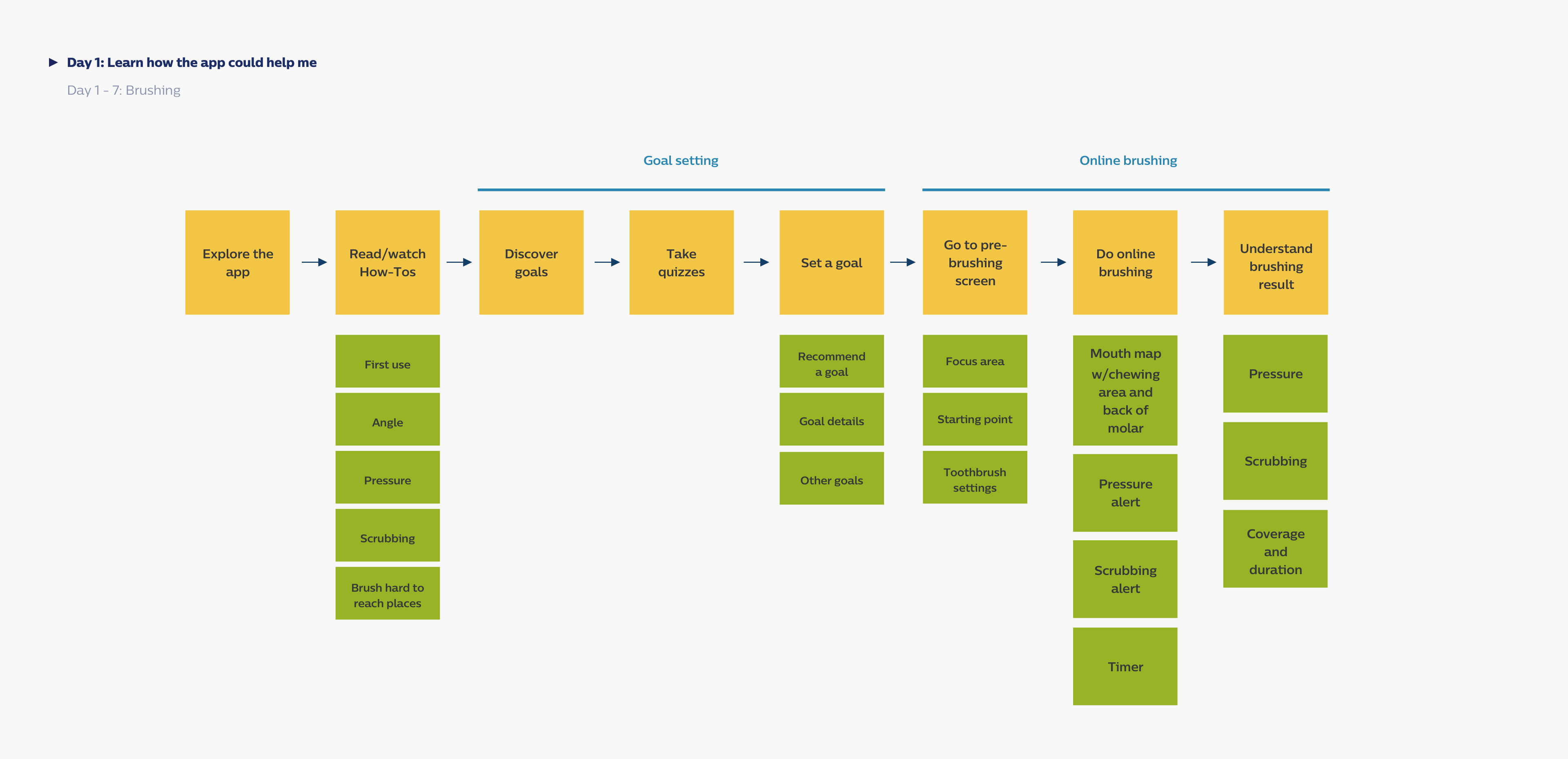
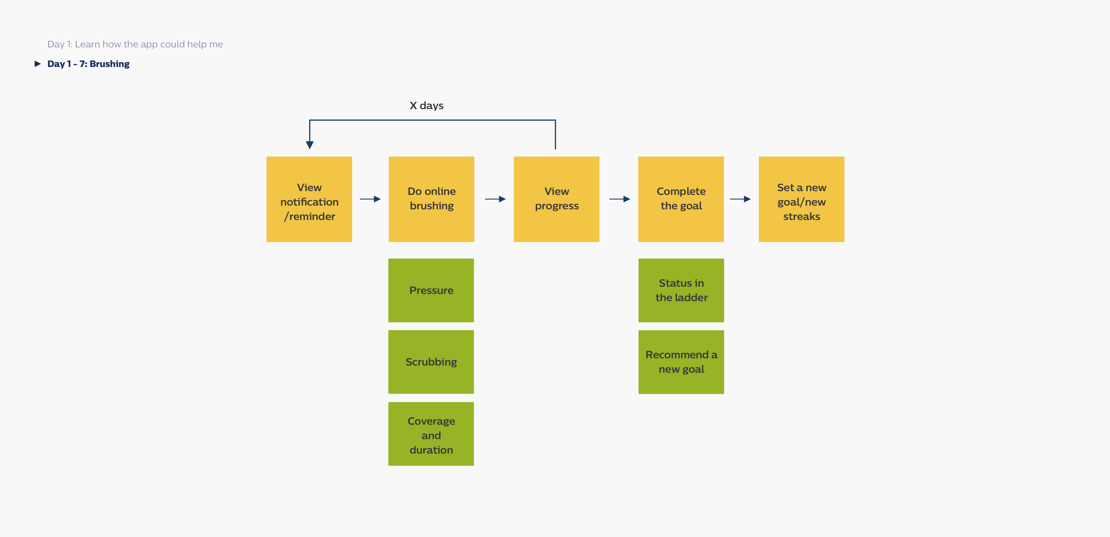
7 day flow
During the first 7 days, users could realize their brush patterns and read and interact with personalized content.
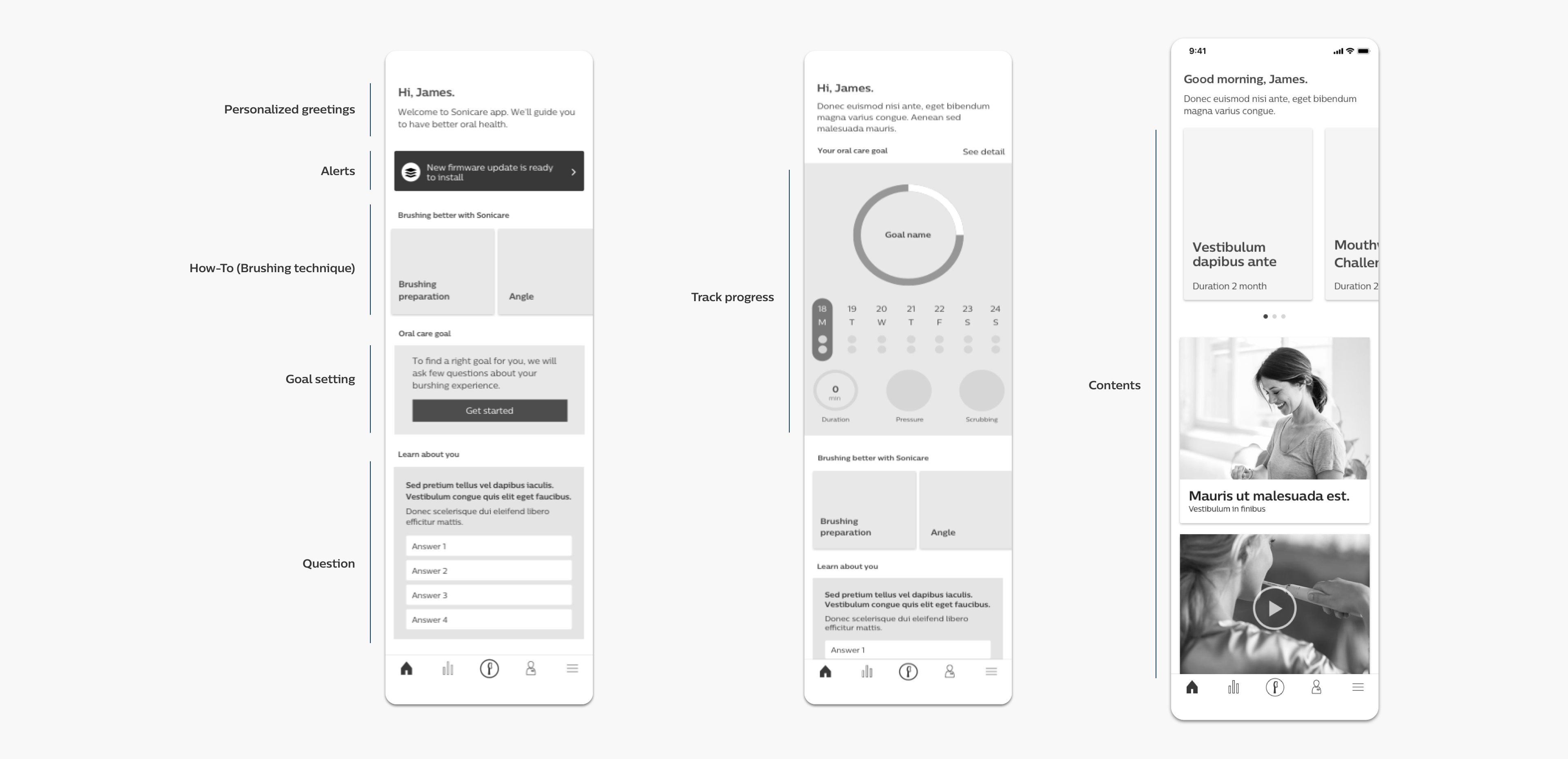
Structure
Defined the hierarchy of information from the research findings. Display the most important content that requires immediate user attention at the top, then display the relevant content below.
Content interaction
Defined the basic interaction of watching learning materials. Bring a simple and focused experience. Also, reduce unnecessary back and forth to choose another content.
UI explorations
Explored multiple design variations to find the right UI design that focuses on bringing a clear hierarchy of information (click the image to enlarge)
Final design suggestion
After rounds of reviews, I finally suggested the design - simple, clear, focused.
Abandoned idea
Throughout the process, I generated many ideas that could possibly not only solve the problems but bring delightful experiences. I want to share the one idea that I didn't get buy-in from a design director. However, I still believe this is a good experience.
How might we make users easy to remember the good brushing technique?
One idea I came up with is asking users to take a quiz. It simply asks about the brush angle, time, frequency, pressure, and scrubbing. While taking this quiz, users can realize how they brushed, and feel confident if they used good brushing techniques. Besides, they can learn, apply, and share the techniques.
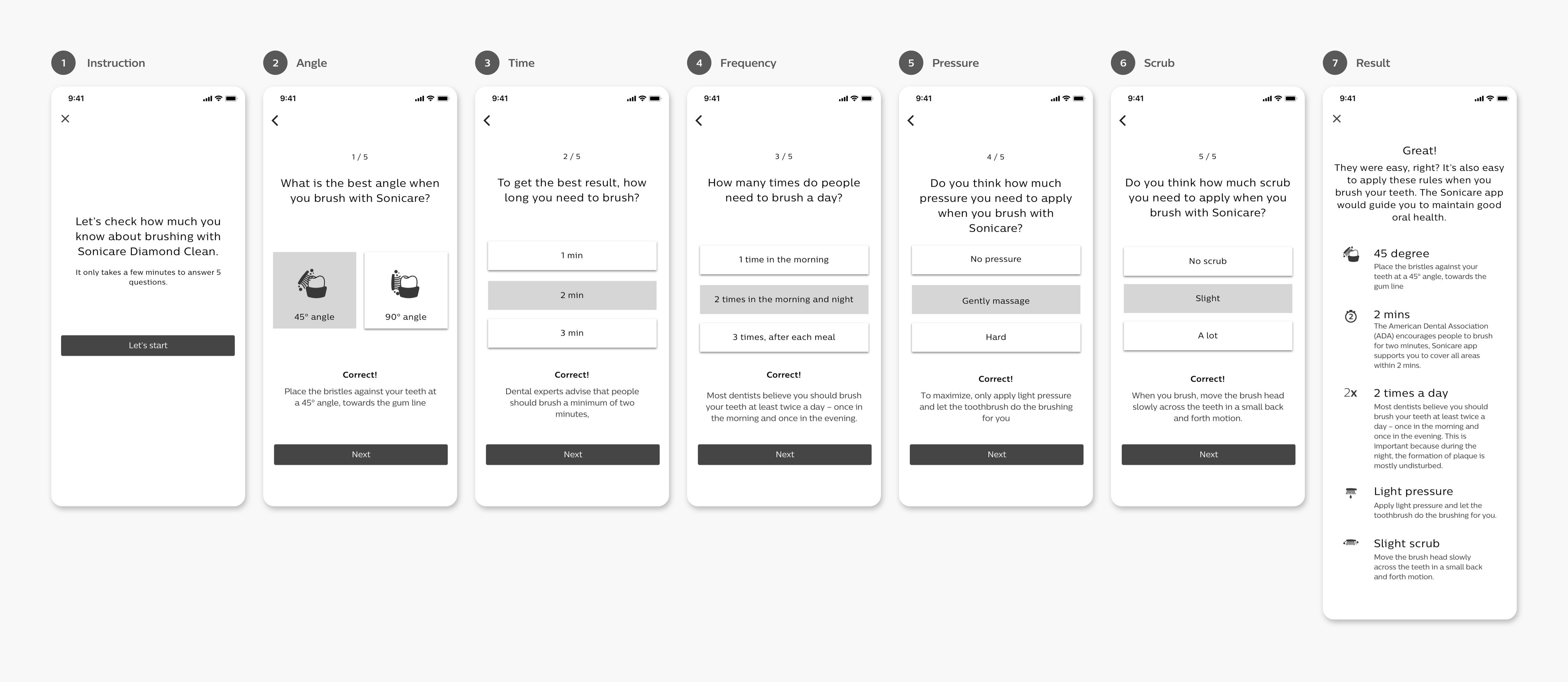
A researcher helped me to test this concept even if this concept didn't get buy-in from a design director because we liked it. The test result was really good. 12 out of 12 participants liked this concept.
- The format of the information display allows the participant to interact with the information
- The usage of quiz format helps the participant remember the advice
- The usage of snippets of information makes it seem easier for the user to consume information in a playful manner
Improved guided brushing
Help users to practice the right brushing techniques
Problems
Users usually do not have a 100% brushing technique and habit compliance because they are not aware of the mistakes they make. This can be caused as they cannot objectively track their brushing and their action becomes perceptual. Eg. spending time equally in different segments of the mouth. Pressure perception, scrubbing perception can vary for individuals.
Experience goal
- Help customers realize and adjust their technique in brushing by presenting objective data and professional info
- Motivate customers to pick up the right technique or habit
- Help customers are aware of their mistakes/errors while brushing by giving instruction and feedback
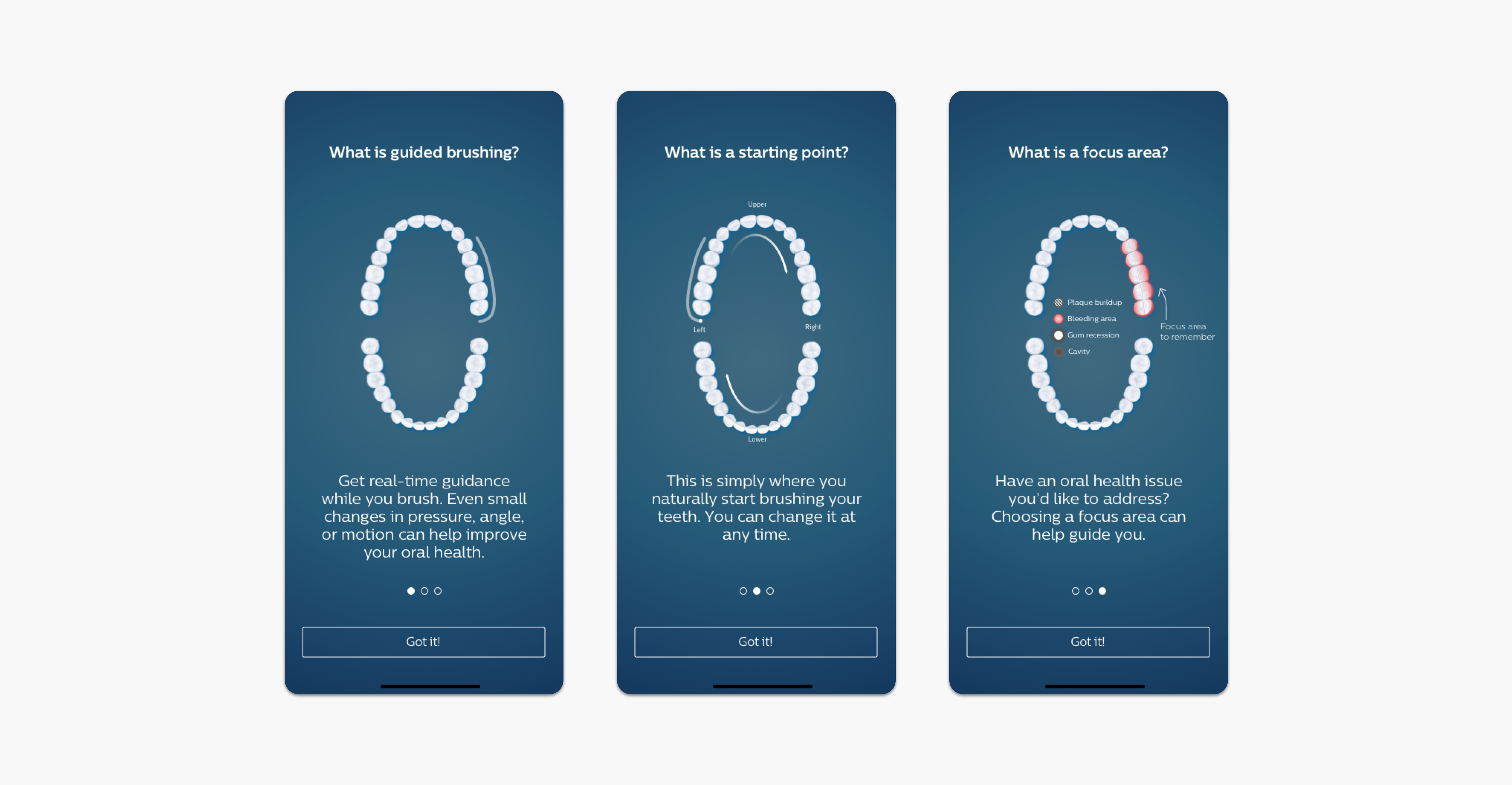
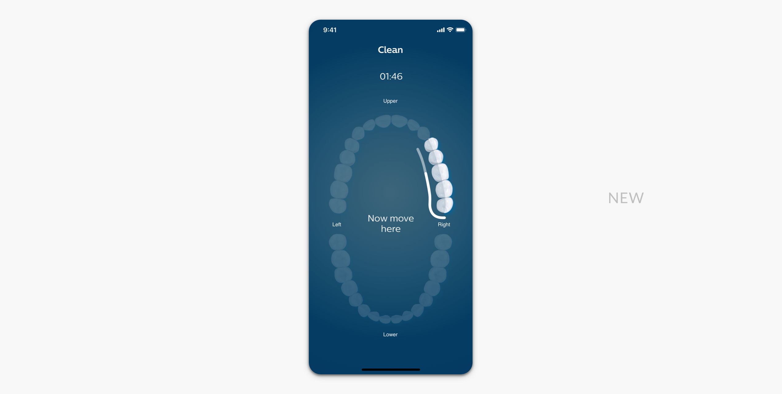
Pre-brush screen
Introduced a Pre-brush screen for first-time users to give an overview of the guided brushing experience.
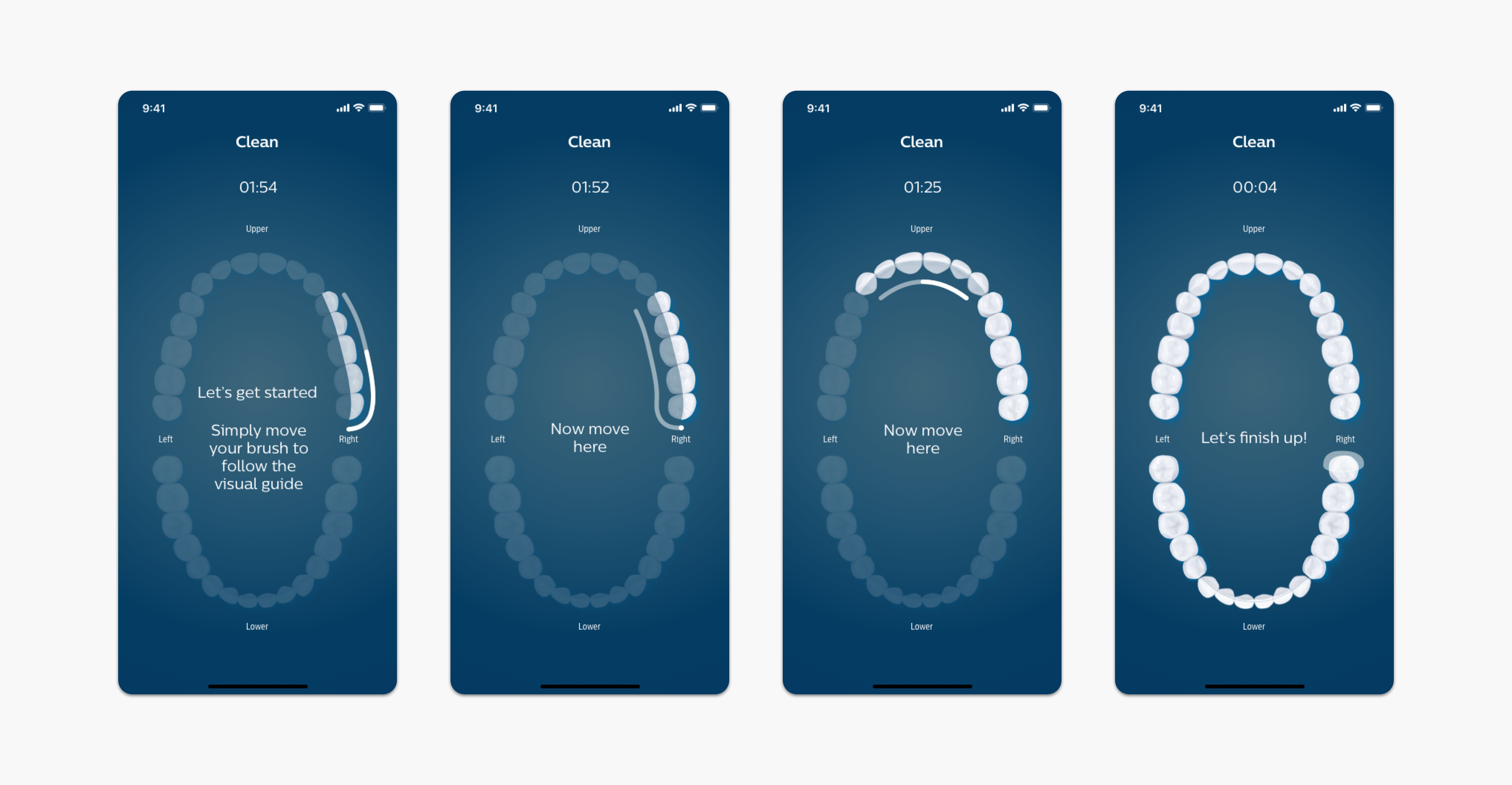
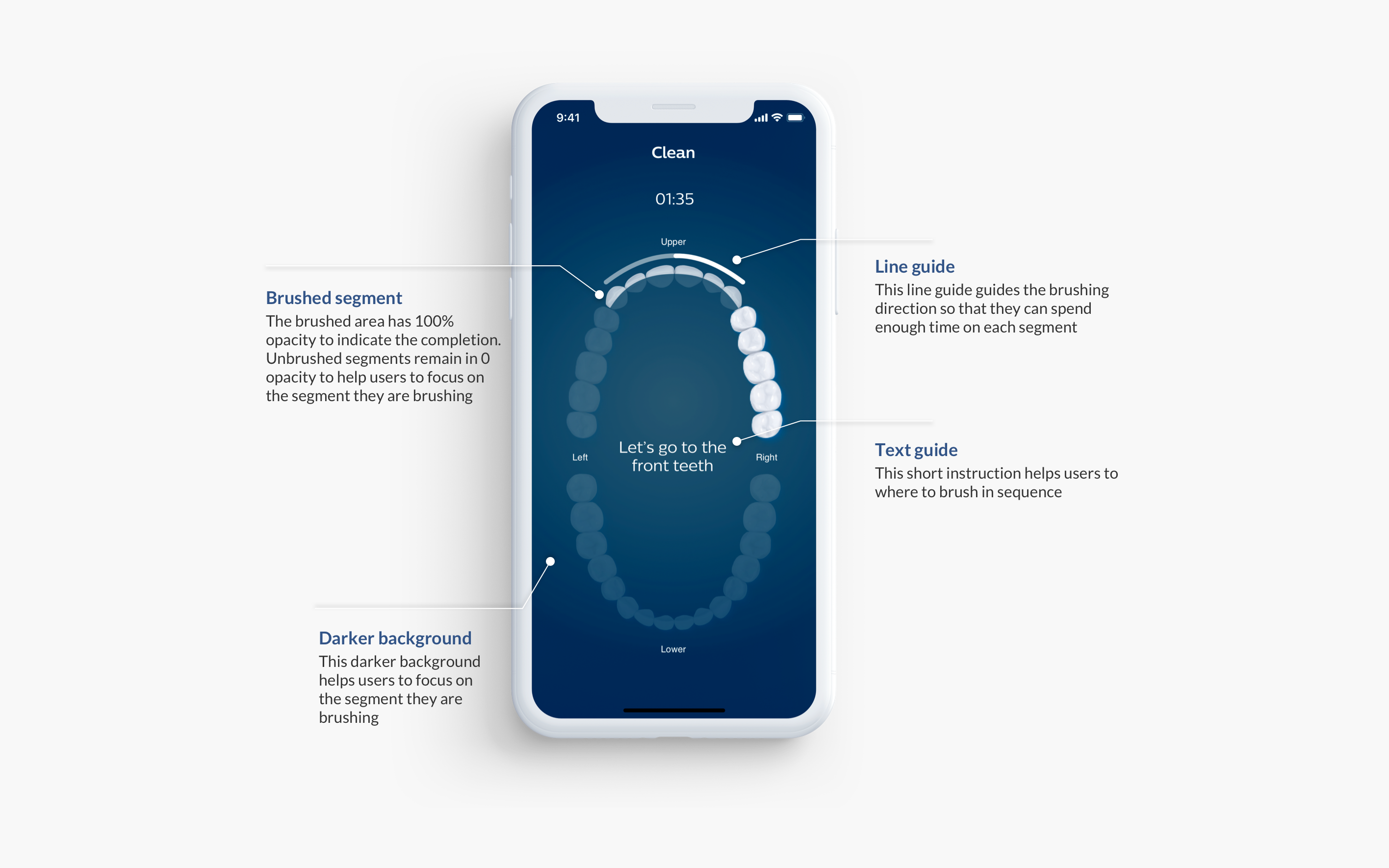
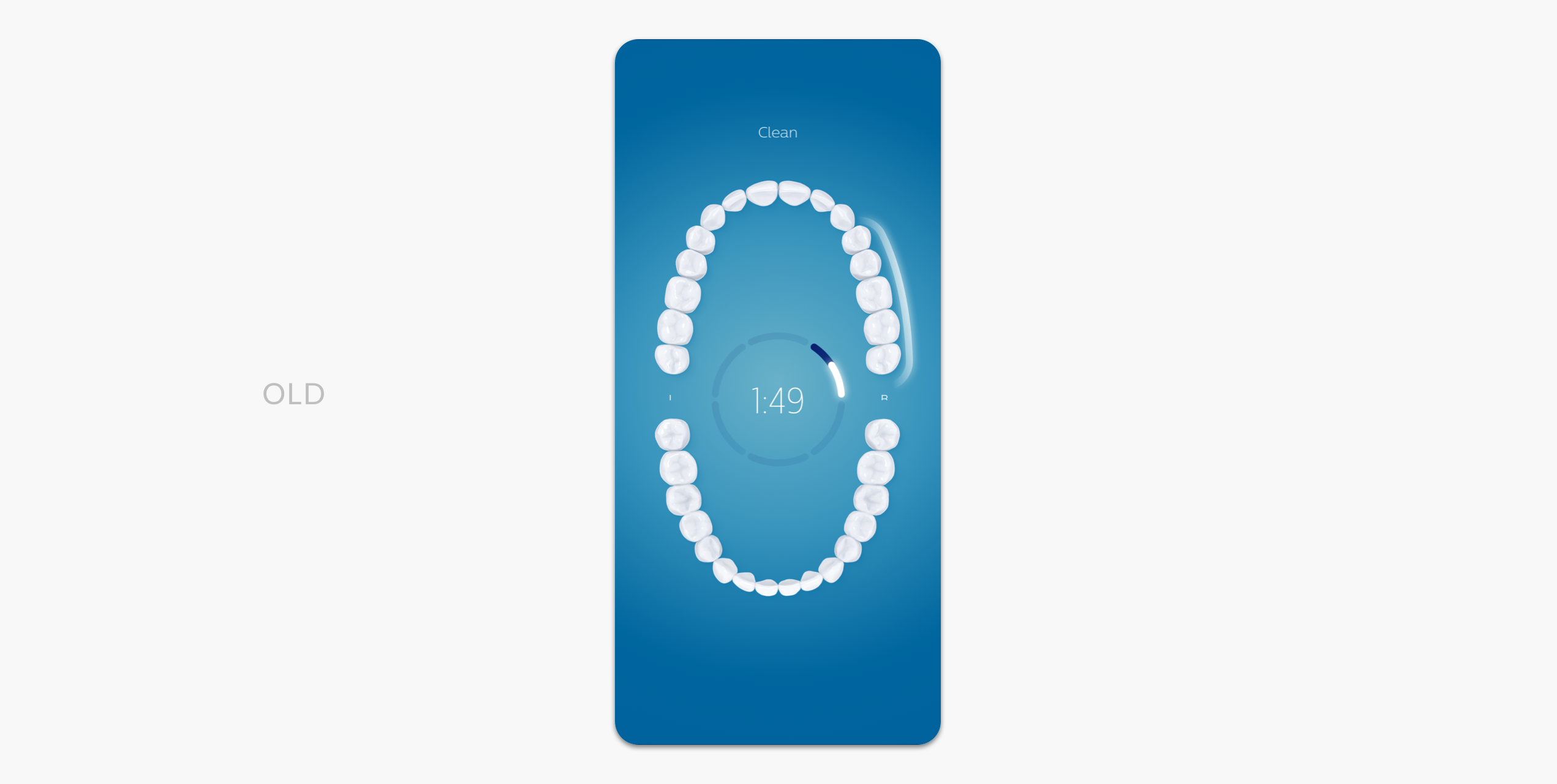
Guided brushing
Provide visual and text guides to help users to brush their entire teeth including the back of molars.
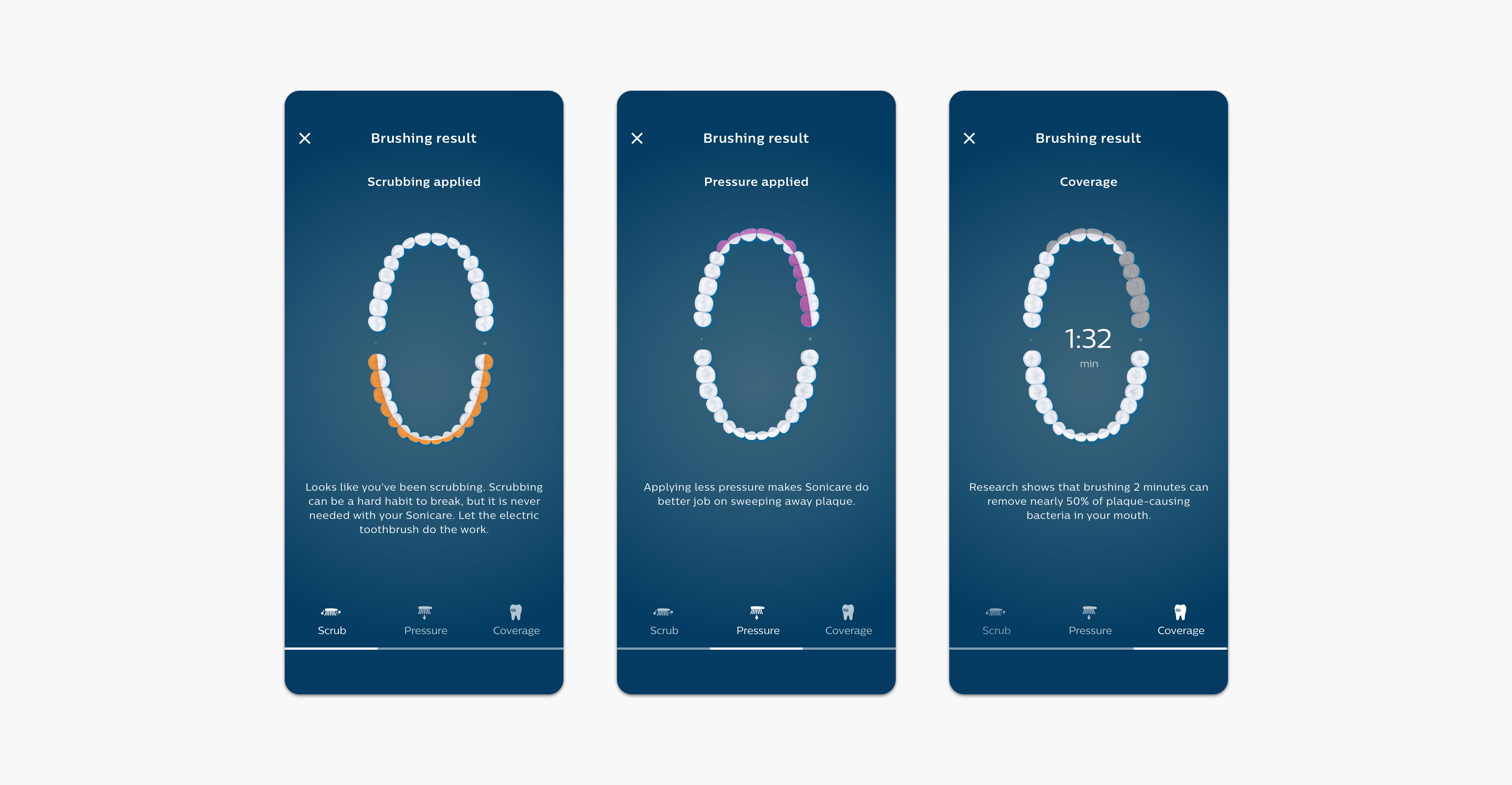
Brushing result
Right after the brushing sessions, users could see the brushing result. There, they could evaluate how they brushed and learn what and how to improve.
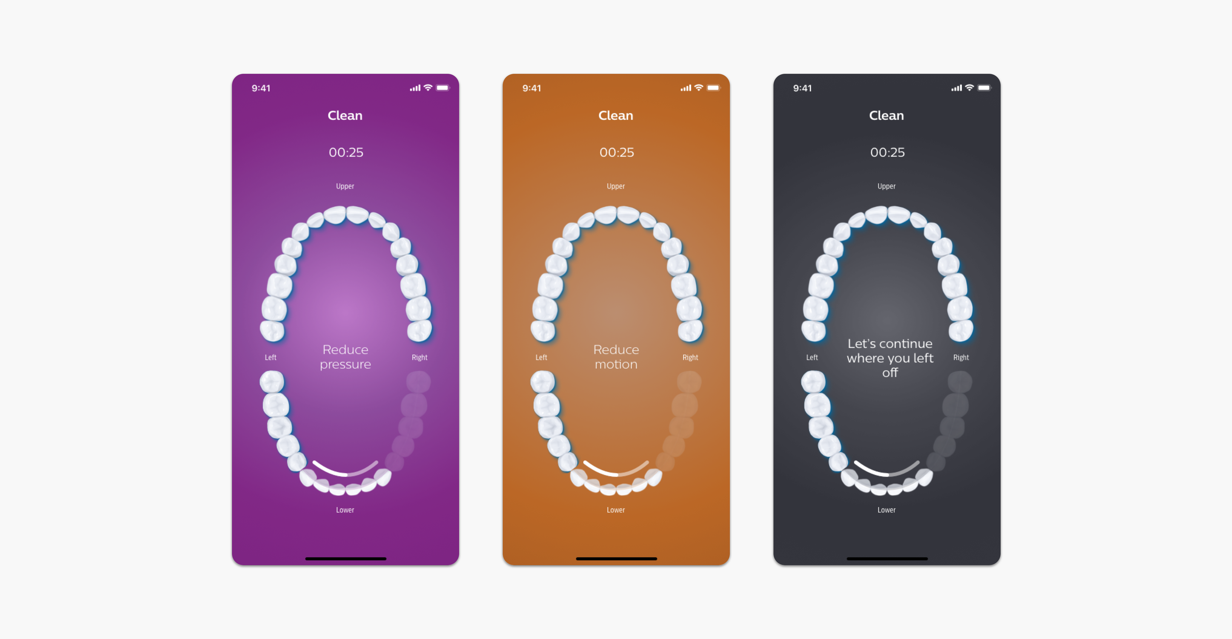
Pressure, scrubbing alert
Found from user testing that users don't hold the phone while brushing. Alerts needed to be more prominent. Decided to use full background color change so that users can quickly check the alerts from distance.
Enhancement
- The opacity of the segment changes from 0 to 100 when they finish brushing the segment
- The line guide helps users to follow the brushing direction
- The line guide starts from the back of molars where most people miss brushing
- Darker background makes the segment more prominent
Toothbrush settings
It allows customers to change the brush mode and the intensity through the app. Designed this feature for the flagship toothbrush.
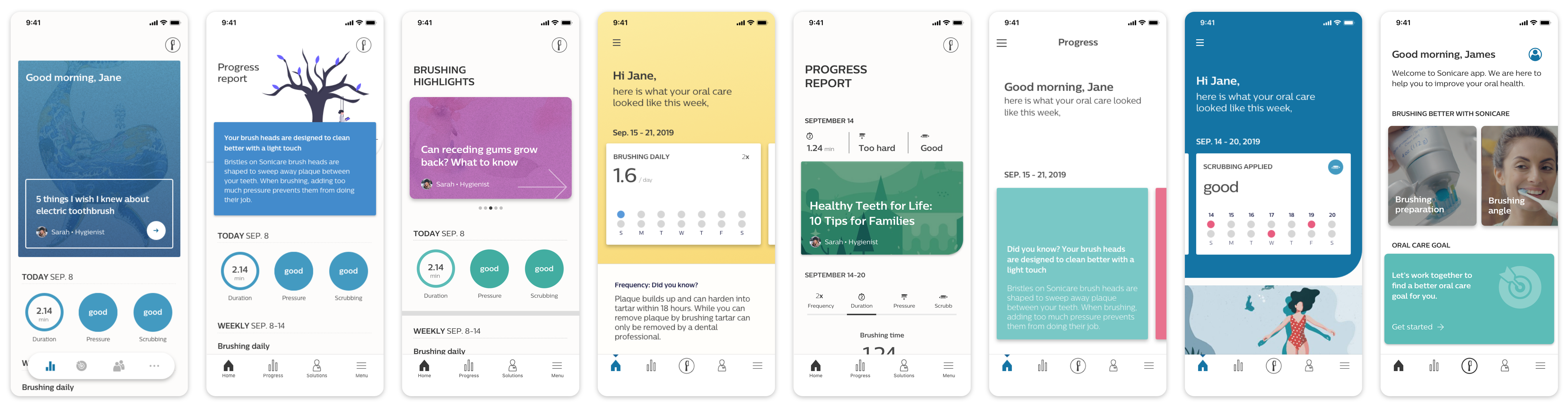
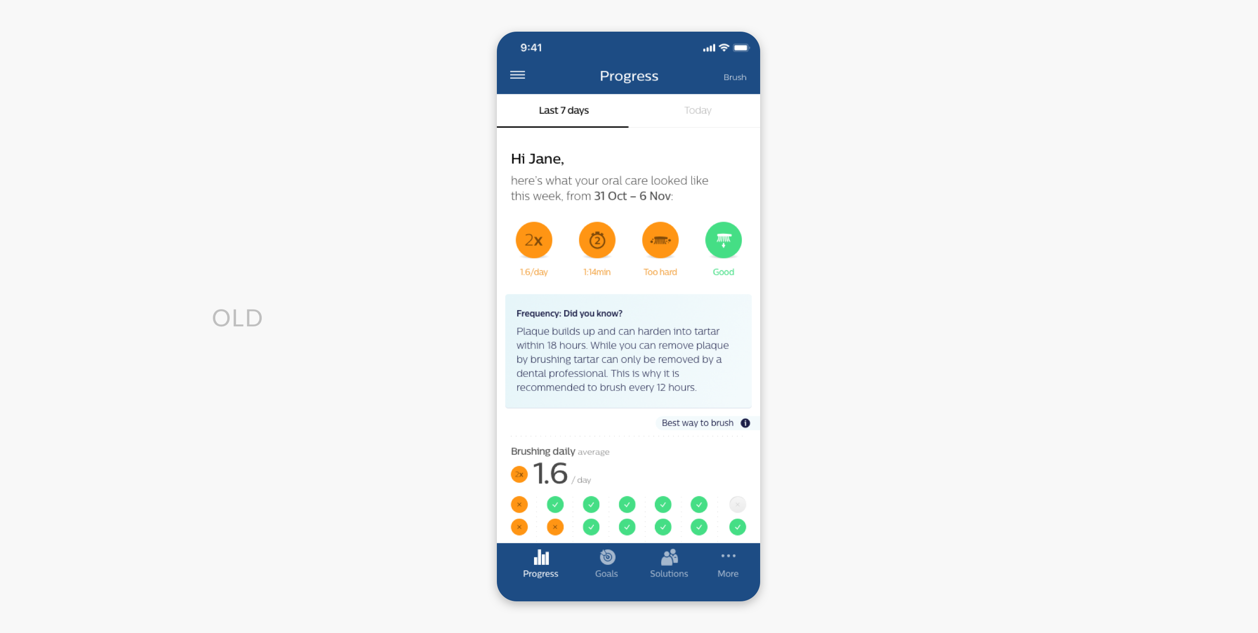
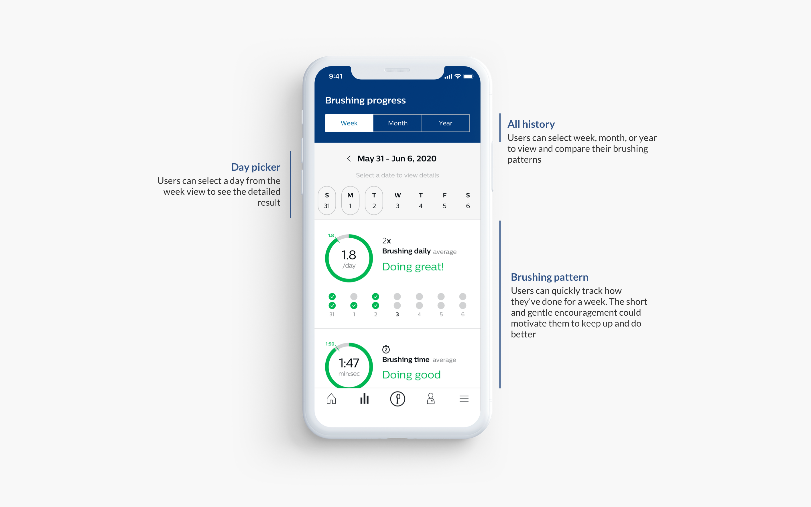
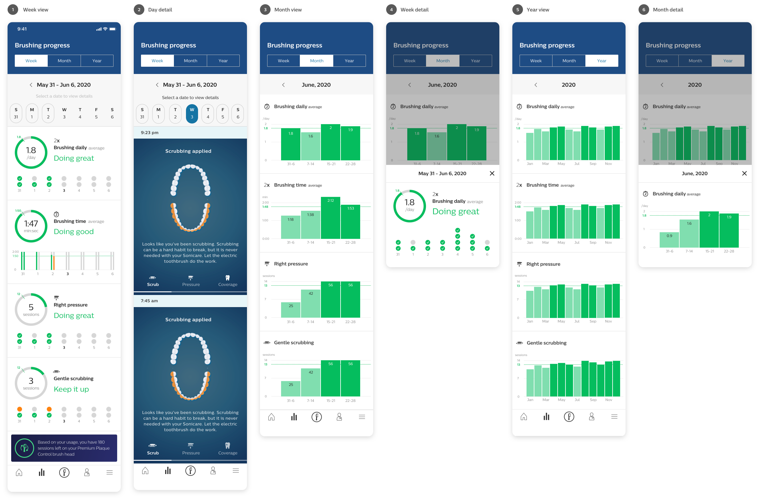
Progress report
Help users to track their brushing progress and see all of their brushing results.
Problems
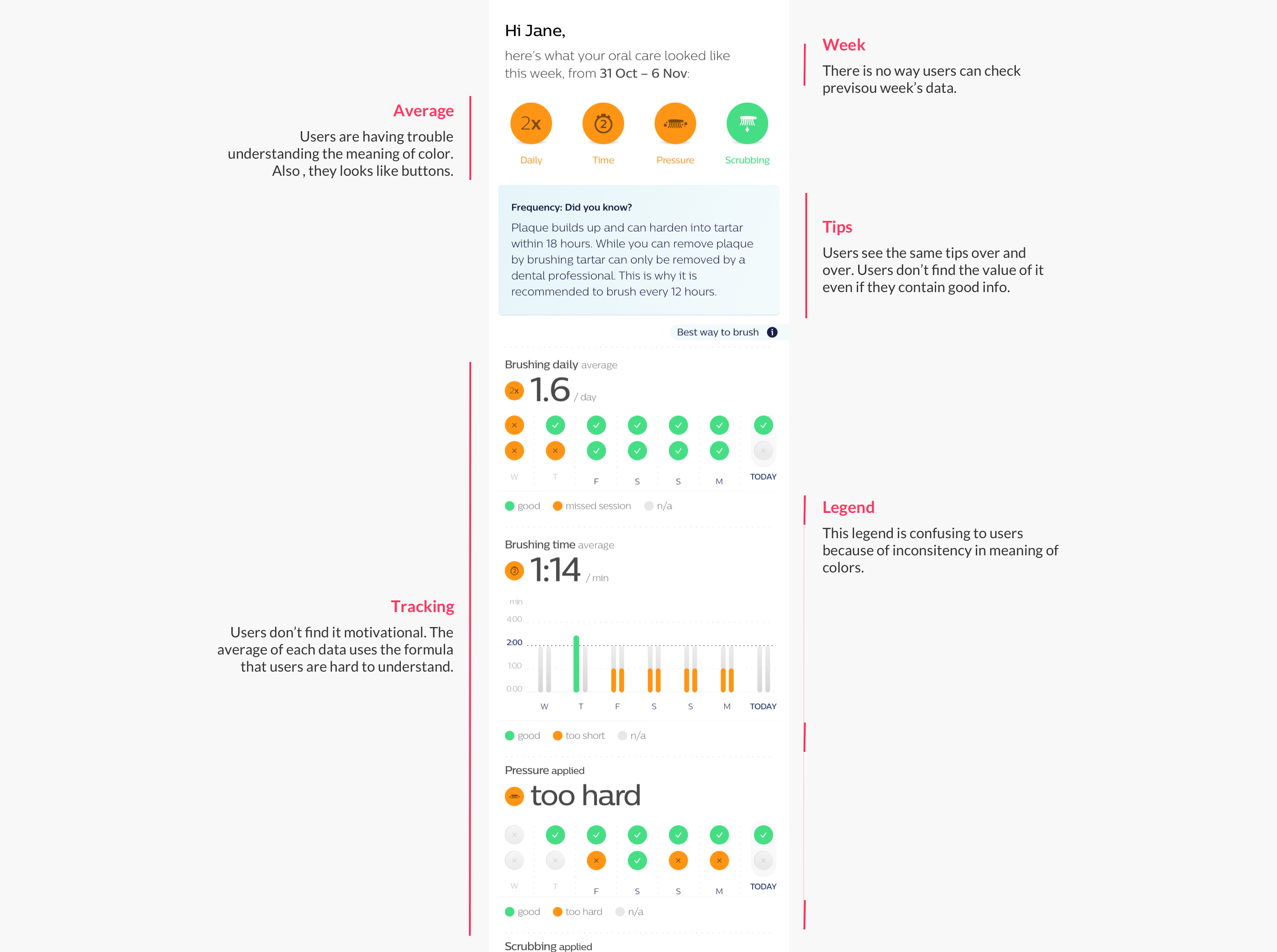
Experience goal
- Simple and clear data visualization that helps customers interpret their brushing histories easily
- Help customers easily identify the area to improve
- Help customers easily compare their brushing results weekly or monthly basis
- Help customers check their brushing results on a specific date.
- Bring a positive feeling.
Enhancement
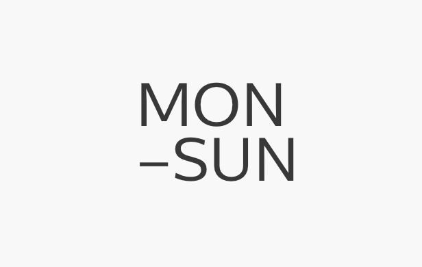
Week base
Every week is a new week. In this way, customers can see what they need to do for the week and are easy to track how they’ve done for previous days.
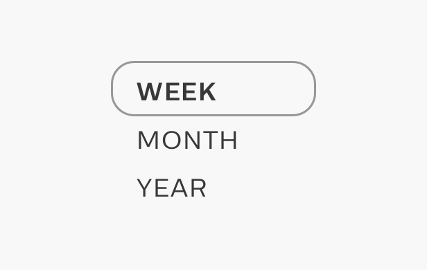
Averages
The enhanced Progress Report covers all of the users' brushing data. Customers can see not only the single session result but the average of the week, month, or year.
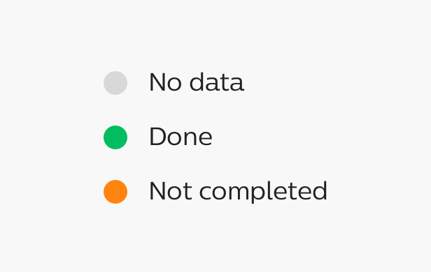
Unified legend
To help customers understand the data easily and quickly, we came up with 3 legends that could be applied to all data.
Final words for the beginning
It was a long journey to build a solid foundation of the app for users. We needed to tackle many barriers throughout the process - align the vision with teams, synthesize all opinions and feedback, understand connecting technology, and meet the tight deadline.
Working with Philips design language system
Philips has a well-established design language system. Balancing between the app's personality and Philips branded design language system was challenging. I explored and iterated designs until we reached the boundaries.
Building a solid foundation
Getting alignment with teams about the UX vision was a fun experience. I learned the importance of communication again. Where there is a will, there is a way.
Working with all teams
One of the most challenging parts was to work with all different teams - product managers, ux researchers, hardware engineers, software engineers, firmware engineers, and Philips design team residing in Netherland. In the end, fortunately, we landed on many good decisions.
Hand-over (Sep. 25th, 2020)
After completing all interaction and interface designs, I handed them over to the newly joined UX designer and the app developers. As a result, the final launched product may look better or worse than what I designed. The final build was released on April 2021.